Quantcast
Channel: Clagnut
Viewing all 55 articles
Browse latest View live

UK Museums on the Web 2012

$
0
0

UK Museums on the Web is a one day conference organised by the Museums Computer Group and held in the lecture theatre of the Wellcome Collection. Representatives from museums and other organisations in the sector shared their experiences over the past year and beyond. Tweets tagged #ukmw12 on the day are archived on TweetArchivist. These are some scattered notes transcribed from scribbles in my notebook.

This year the conference was dubbed ‘Strategically Digital’. It was a fascinating, insightful day with some really engaging speakers. The format worked well, with three lots of three presentations on a theme followed by a brief panel discussion with Q&A. Coincidentally this a format Clearleft will be employing at our forthcoming Responsive Day Out.

Paul Rowe, CEO of Vernon Systems, and with the strongest New Zealand accent I’ve ever heard, gave us a typically witty keynote. He encouraged everyone to share their content and make it available everywhere. APIs, Commons media, and loose licenses to the fore.

Andrew Lewis, Digital Content Delivery Manager (I like that this role exists) from the Victoria & Albert Museum talked about the gradual transformation to becoming a digital first organisation. He described how that necessitated a brand new, top-down, governance structure to ensure consistency and longevity of technologies, and to avoid duplication of ideas across departments. Digital, he said, does not respect departmental boundaries.

Rich Barrett-Small, lead web developer at the V&A, followed up with his view ‘from a dark place’. He used the analogy that his team worked as an Agile barrel tumbling through the waterfall processes of an inherently un-agile organisation. He urged museums not to embark on any digital project longer than 3 months, or if it really needs to be longer than that, deliver something tangible after each three months.

In the audience, Stuart Dempster from Jisc (which works on behalf of UK higher & further education to champion the use of digital technologies and is responsible for JANET) made the point that part of digital strategy should be managing your organisation’s online reputation. At it simplest, that means – among other things – replying to tweets and answering comments on TripAdvisor, and making changes in the real world if those comments highlight areas needing improvement. Stuart also mentioned that the Heritage Lottery Fund has finally agreed that digital output from a cultural institution is something it is prepared to fund.

Charlotte Holmes from the Museums Association, which she said represents museums and their suppliers, talked about CPD with respect to digital. She said they require more mentors to help people achieve the professional qualifications they offer (AMAs). It seems to me that people outside of the sector itself, a digital design agency for example, could be able to help in this regard, although some business development opportunities in return would probably be desirable. It was hard to tell if they was any desire for either.

Tom Grinsted, product manager of core mobile apps for the Guardian gave a brief but entertaining view of the rapidly changing face of digital audiences, or “How I learned that there’s no such thing as a digital consumer”. Which about sums it up. He showed that use of the Guardian iPad app peaks first thing in the morning, but not in the evening; whereas the website viewed on a tablet peaks in the evening but less so in the morning. The main takeaway being: when designing don’t partition people, partition actions; in other words there’s no such thing as a mobile user.

Nick Poole, CEO of the Collections Trust presented some pithy truths about creating digital resources:

  • access ≠ value
  • open access ≠ lower sales
  • digital ≠ audience

Nick talked about determining the return on investment of providing a digital resource, not so much in financial terms but in terms of a cultural return. That linked perfectly into the next talk. Simon Tanner from the Department of Digital Humanities at King’s College London talked passionately about Curation & Impact for the Digital Age, with the emphasis very much on impact, which is akin to the ‘return’ described by Nick in the previous talk.

Simon defined impact as “the measurable outcomes arising from the existence of a digital resource that demonstrate a change in the life or life opportunities of the community for which the resource is intended.” Put simply, how does your digital presence affect people’s lives? Loads more details, including how to present a convincing evidence-based argument for digital resources are available for download on the KDCS website.

Claire Ross and Jane Audas talked about their experience trying to run digital R&D with the Imperial War Museums. They came across similar difficulties to those highlighted by Rich Barrett-Small in trying to do Agile in a fundamentally non-agile environment. Long term outputs (5 years plus) with lots of stakeholders wanting to ‘sign off’ does not map to a process of continuous iteration.

Part of their project was enabling museum visitors to write comments on the exhibits using a kiosk next to the exhibit itself. A battle won was allowing for ‘radical trust’ and the realisation that post moderation works: visitors may write inane comments, but never offensive ones. Oh, and QR codes don’t work.

Mentioned in passing was the fascinating WW1 Discovery project which aims to make resources about the Great War more discoverable, and find new and innovative ways to present this content for the benefit of education and research. Also cropping up was the Google Cultural Institute, which I’ll admit I’d never come across, probably because while Google claims it is “building tools that make it simple to tell the stories of our diverse cultural heritage” it all looks very closed.

The afore-mentioned Stuart Dempster was up next and quoted Nat Torkington excellent article Libraries – Where It All Went Wrong. The choice bit being:

I look at the results of digitization projects, I find the shittiest websites on the planet. It’s like a gallery spent all its money buying art and then just stuck the paintings in supermarket bags and leaned them against the wall.

Finally came Katy Beale from Caper who talked about a few of their fun ventures, including Culture Hackday and the Happenstance project, the James Bridle and Natalia Buckley part of which happened in Clearleft’s building.

All in all it was a thoroughly interesting day, especially from one who is somewhat of an outsider, and I got to have some fascinating conversations in the break. I’m really looking forward to Clearleft working more with museums, galleries and others in this sector.

Read or add comments


A new year, a new design

$
0
0

To my surprise, Clagnut.com was last redesigned in September 2008 – that’s getting on for 6 years ago. Well, that’s all changed now, as will be evident to you, unless you’re viewing this in a RSS reader (remember those?).

I’m still pleased with the 2008 design – I think it held up reasonably well – but it was fixed-width, designed with the grid first, and starting to feel a bit ‘small’. I felt the site needed a redesign, created from the typography outwards, responsive from the beginning and elegant on huge as well as tiny screens. That and I really want to write more, so I felt – in true procrastination style – that I needed a new design with a lovely reading experience to encourage that writing to happen.

Book cover showing similar colours and typographic treatment
Front cover of Designing News

Inspiration

After a few false starts to the redesign, I came across a fabulous book, Designing News by Francesco Franchi and was hooked. It’s not hard to see that I ended up unashamedly using the book’s front cover as a basis for my graphic design. I hope Francesco can forgive me for butchering his fine work and adapting it for my own purposes.

Typography

Where my design is different to Franchi’s is in the choice of type. In all of those false starts, I had been trying to combine a high contrast serif font, set large for headings, with a sensibly sized contemporary sans for the body text. More and more I found myself drawn to the same two typefaces. Michael Hochleitner’s Ingeborg for the headings, and Akagi by Neil Summerour for the body text.

To my eyes, Akagi and Ingeborg have common typographic ancestry. They both have a vertical stress with a sturdy, rational approach tempered by a certain glamour – the very definition of substance and style. The two typefaces have similar flourishes such as the eye to the lower case g, and matching letterforms such as the lowercase a and y. The low-contrast Akagi Medium works extremely well on screens, and juxtaposes really well with the high contrast, almost fat-face Ingeborg Heavy. It works for me. As you might expect, both fonts are served up by Fontdeck.

Comparison of the two fonts
Ingeborg Heavy / Akagi Medium

Responsiveness

Firefox Responsive Design View
Responsive Design View

I’ve used responsive design techniques to help the site be nicely readable on lots of devices. At the time of writing, there are nine break points, including height as well as width. All the media queries are set in em rather than px as the break points are designed around where the design breaks rather than an arbitrary screen size. The Firefox Responsive Design View proved invaluable before an actual device testing on the Clearleft test lab was involved.

I’ve put together a kind of style guide, mostly as a check that all likely mark-up is styled appropriately. While the site has not been widely tested, it should be fine on all modern browsers. Please let me know if you come across any problems. You can also read more production details in the colophon.

Home Page

The home page is now slightly more dashboard-like, in that I wanted to include a lot of ‘live’ content from my presence elsewhere on the web. So interspersed among the blog posts are photos from Flickr, tweets, music scrobbled via Last.fm, extracts from Kennedy app, and my current Jam.

Blog Post Pages

The reading experience of the blog posts should be better now, and they can now handle much larger images and tables. I’m using machine tags to pull in photos from Flickr where relevant. The related posts should soon become more relevant too. I’m planning on introducing a calendar view to the archive, but for you’ll have to make do with paging through months and categories.

What No Comments?

The site is built on my homemade CMS written in PHP and MySQL. Unfortunately, since the great database disappearance comments have been turned off. I might reinstate them at some point in the future, but for now you can contact me by other methods. The whole site is now hosted by Vidahost who have a simpler and more reliable database backup system than Joyent clearly did.

Read or add comments

In conversation with Brighton station about CCTV

$
0
0

A few days ago I was stuck at Brighton railway station, watching trains get delayed and eventually cancelled. In the end I gave up waiting for carriage to take me to my meeting in London, and went back to \the office\. But while I sat on the concourse I noticed – not for the first time – the sheer amount of CCTV, cameras, and various surveillance devices in plain view all around the station.

\"Montage
A selection of the surveillance in Brighton station

In this day and age, and especially here in the UK where we have \the most CCTV per capita in Europe\, we as society have come to expect and seemingly accept having a few cameras in public places like railway stations. Personally I\’m very dubious about the efficacy of CCTV as means of crime prevention, I\’m even less convinced about the cost effectiveness – FOI requests reveal that one installed camera costs around £20,000. And I\’m perturbed further still about where that footage goes and how it is used.

Anyway, I saw all those cameras (there are 28 in the photo) and was a bit bored, so I did what any good citizen would do. I tweeted about it:

‏@clagnut 9:19am, 7 Feb 2014
CCTV gone mad in Brighton station (there are 3 banks like this). Is this really acceptable @southernrailuk? \pic.twitter.com/YstXebY2y8\

Soon after, I got a reply. Turns out \Brighton Station\ has got a Twitter account.

‏‏@brightonstation 9:44am, 7 Feb 2014
.@clagnut I guess it depends if your loved ones have been assaulted or not and you want to catch the scoundrel

And \the conversation\ continued as only Twitter can. It got a bit interesting here and there.

‏@clagnut
@brightonstation Proportion. Privacy.
‏@clagnut
@brightonstation Also, how many convictions have there been thanks to the CCTV? Have crime rates decreased since their installation?
‏@Binarytales
@clagnut I believe they are facial recognition cameras focused on the gates. Not that that makes it okay.
‏@brightonstation
.@clagnut if you look, they are mostly focused one per gate, to catch naughty ticket people/protect staff and pax from unfounded allegations
‏@clagnut
@brightonstation That might be why you use the cameras, but what happens to the recordings? We’re given good reason to paranoid recently.
‏@Belladax
@brightonstation @clagnut ah, that makes more sense. Revenue protection, not really looking out for our \’loved ones\’.
‏@brightonstation
@Belladax If you were assaulted on station and then they said they had removed cameras to protect the innocent, would you be happier?
‏@Belladax
@brightonstation I absolutely appreciate the need for security, but wld hope enough staff on duty to help. As @clagnut says, bit excessive
Brighton Station
@Belladax Realistically, to get a prosecution in 2014 you need good clear facial cctv, word of staff not enough for CPS usually
‏@Belladax
@brightonstation good to know, thanks. You get a lot of assaults?
‏@brightonstation
@Belladax I have 16mil people through me a year, and at weekends in summer a lot of boozed up landlubbers come down to party too hard!
‏@brightonstation
@clagnut The station is private property and there are signs saying there is cctv. I bet your local newsagent has more cameras per sq foot
‏@ShirtlessKirk
@brightonstation @clagnut Well hidden signs. Plus, Waterloo has the most cameras of any terminus yet doesn\’t have any gate-facing ones…
‏@clagnut
@brightonstation Specious argument. My newsagent can’t track my movements and isn’t connected to national infrastructure.
‏@bh_community
@clagnut never heard of internet eyes?

I should probably add that I\’ve no idea if \@brightonstation\ actually speaks on behalf of Southern Rail – the \general opinion\ is that the account is an enthusiast, rather than an official account.

Read or add comments

Web Typography is now open source

$
0
0

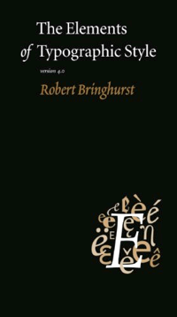
In December 2005 I launched Elements of Typographic Style Applied to the Web, a practical guide to web typography using Robert Bringhurst’s book The Elements of Typographic Style as a basis.

Cover of the Elements of Typographic Style

The site has been referenced and linked to many times over the subsequent 8 years, which has been wonderful to see. At the moment however, the whole site is in need of updating and completing (in as much as completion is actually possible). It’s also suffered a number of outages and database losses, and while I believe the design still holds up, it could probably do with a bit of responsiveness (at least it was liquid from the start).

For these reasons, I have now committed the site to open source, so if you feel inclined to contribute in any way, you can fork it on GitHub, as the saying goes.

In preparation for opening up the source, I’ve reworked some of the guts of the site to remove the need for a database. It still uses my ropey PHP and much of my 8 year old CSS, but it works, and frankly I’m far more interested in the content being updated. I will continue to maintain the site and apply changes, merge forks, etc as they happen. In fact the whole exciting process of open sourcing the site has given me renewed enthusiasm for the project, so I hope to be making plenty of updates myself.

Read or add comments

The Big Dog Cometh

$
0
0

Photo
Dave and Mikey climbing through Stanmer woods

Back in December I [knackered my Achilles tendon](https://twitter.com/clagnut/status/409365946919559168) while out running. Since then I’ve been [getting back into cycling](https://twitter.com/clagnut/status/424099628217561088). As much I enjoy running, cycling and [mountain biking](/archive/biking/) in particular is my first love but has taken something of a back seat since the arrival of kids and a lack of other people to ride with. I’m perfectly happy running on my own, but the joy of cycling I find is greatly enhanced when in a group.

Anyway that’s all changed this year. I’m out on the bike(s) a lot more, I have friends in and out of work who ride, and I’ve discovered new places to go.

One of those places is the woods surrounding Stanmer Park on the edge of the South Downs. It’s a small area, but the riding is fun with a decent bit (300m) of climbing and lots of technical singletrack to enjoy. It’s the closest thing within easy reach to my [beloved North Downs](/blog/202/).

In August one of Britain’s biggest mountain races comes to Stanmer Park. The [Brighton Big Dog](http://www.brightonbigdog.com/) is a 6 hour endurance race winding through the very woods we ride every week.

The Big Dog can be ridden by individuals (*no thanks*) or by teams of three in a relay (*much more sensible*). [Clearleft](http://clearleft.com) is entering a team – me, Jon and Mikey. We don’t have any hopes of placing well in the race, but it should be a fun day.

Brighton Big Dog from Morvélo Bicycle Apparel

None-the-less I’d still like to give it a decent shot, so I’m trying to get in shape. It’s a something of a course for good climbers, so the first thing I want to do is get my weight down to 80kg – I’m currently 83.5kg. Hopefully keeping an eye on my eating (and drinking) combined with plenty of riding will get me in better shape by August.

Watch this space, and my progress on Strava.

Read or add comments

Soft hyphen bug in Webkit

$
0
0

Recently a [Fontdeck](http://fontdeck.com/) customer asked for help regarding a problem he was having with a soft hyphen. As I investigated further, it revealed a peculiar bug in Mac-based Webkit browsers, including Safari and Chrome. The bug may also be present in other operating systems, but for reasons that will become apparent, it doesn’t manifest itself.

## What is a soft hyphen?

Soft hyphens enable you to manually insert hyphenation points in words, predating the ``hyphenate`` CSS property. Thus a soft hyphen is a hyphen which is only displayed when a word is split across two lines. Put another way, the character says ‘hyphenate here if you need to’.

Soft hyphens can be represented by the HTML entity ``­`` or the Unicode character ``U+00AD`` (in the Latin-1 Supplement range between ¬ and ®).

## What is the bug?

I’ve written about [soft hyphen bugs](/blog/329/) before, but this is different: under some circumstances, when using webfonts (any webfonts, not just Fontdeck) Mac Webkit browsers will display the missing glyph￰ symbol where the soft hyphen is placed.


![The ￰missing glyph symbol displayed where the soft is placed](/images/shy-screenshot.png)
Screenshot of the soft hyphen bug in Chrome/Mac v36

I’ve created a [test page](/sandbox/shy.php) to illustrate exactly when this occurs. In essence it only happens with sans-serif webfonts of font-weight 100 or 200. Heavier weights, serif and monospace fonts are unaffected. It also only happens if the default sans-serif font in your browser is Helvetica (the factory setting).

## What’s going on?

I’m not exactly sure what or why this is happening, but it seems down to a problem with the font fallback mechanism and a bug in Helvetica Light.

The [Mozilla Developer Network](https://developer.mozilla.org/en-US/docs/Web/CSS/font-family) has this explanation about font fallback:

> The ``font-family`` property specifies a list of fonts, from highest priority to lowest. Font selection does not simply stop at the first font named in the list that is on the user’s system. Rather, font selection is done one character at a time, so that if an available font does not have a glyph that can display a character needed, the later available fonts are tried.

In [my examples](/sandbox/shy.php), the web font I’m using is [Aperçu Light](http://fontdeck.com/font/apercu/light). Like most web fonts – indeed most fonts – it doesn’t have a soft hyphen glyph. So when the browser comes across one in the content, it needs to go down the font stack to find a font which does contain a soft hyphen.

In the case of ``font-family: “Apercu Light”, sans-serif`` the browser tries to render a soft hyphen from the Helvetica Light OS X system font. Helvetica Light does seem to have a place mapped for a soft hyphen, yet it is rendered as a missing character￰ glyph, indicating the character is not in fact available.

Chrome Developer Tools

### This is where is gets peculiar

If we swap Aperçu Light for Helvetica Light, as in ``font-family: Helvetica, sans-serif`` then Webkit seemingly recognises the problem with Helvetica Light and decides to use a soft hyphen from Lucida Grande, which renders correctly.

(You can tell this by selecting the text and looking at the Computed tab in Chrome’s Developer Tools.)

If we now insert Helvetica into our web font stack, as in ``font-family: “Apercu Light”, Helvetica, sans-serif``, Webkit doesn’t resort to Lucida Grande, it still tries to render Helvetica Light’s broken soft hyphen.

## There is a fix

And that fix is Arial! Stick Arial somewhere appropriate in your font stack and soft hyphens render as required, eg. ``font-family: “Apercu Light”, Helvetica, Arial, sans-serif``. Other system fonts work too, notably the afore-mentioned Lucida Grande, as do Helvetica Neue and Avenir Next, but curiously Avenir suffers the same problem as Helvetica.

And since Blink has branched off from Webkit but still contains the issue, I’m going to have to post the bug in [two](https://bugs.webkit.org/) [places](https://code.google.com/p/chromium/issues/list?can=2&q=cr=Blink).

Read or add comments

Scattered notes from Dots

$
0
0

The inaugural [Dots conference](http://brilliantnoise.com/dots/), organised by the nice folk at [Brilliant Noise](http://brilliantnoise.com/), provided a very enjoyable day on the loose subject of innovation. I was in a mood to listen rather than take notes but I did jot down a few bits and bobs. Here they are made into some sentences. Far more detailed notes can be found on the [Dots website](http://brilliantnoise.com/dots/).

### Russell Davies

Opening the day, Russell reprised his GOV.UK talk. It’s interesting and remains an inspirational (and useful) story but one I’ve heard many times before in various guises from either Russell, Ben or Leisa. That said Russell was his usual entertaining self (although not approaching his magnificent performance at dConstruct 2012) and there were many surprised cats.

### Hugh Garry

Hugh Garry, director of Storythings, will certainly be remembered for weaving the story of Spandau Ballet through his talk.

> Anyone remember when Spandau Ballet were a brilliant band?

I’d certainly agree that [To Cut A Long Story Short](https://www.youtube.com/watch?v=JE2sCISQmpE) is a fine song. Anyway Hugh’s talk riffed on ideas and how to get them. He mentioned the book [A Technique for Producing Ideas](http://www.amazon.co.uk/dp/1907590137?tag=jalfrezi-21) by James Webb Young. He quoted Tom Waites (actually Elizabeth Gilbert paraphrasing Tom Waites [on Radiolab](http://jjeeffff.tumblr.com/post/8070491509/every-song-has-a-distinctive-identity-that-it)):

> There are songs you have to sneak up on, like you’re hunting for a rare bird. And there are songs that come fully intact, like a dream taken through a straw. And there are songs that you find little bits of, like pieces of gum underneath a desk, and you scrape them off and you put them together and you make something out of it. And there are songs, he said, that need to be bullied…

Garry advised us pseudo-scientifically to use the back of our brain (responsible for the subconscious) rather than the pre-front context, responsible for planning. Or, referring back to the demise of Spandau Ballet, never to swap a synthesiser for a saxophone. Amen to that.

### Ian Crocombe

Ian Crocombe of Evolver was about using data to get your innovation initiative supported. Essentially when pitching your idea to senior stakeholders, who as a whole are demonstrably conservative and technophobic, show that your innovation can positively affect these three core metrics (in this order):

1. Grow revenue
2. Reduce costs
3. Increase advocacy

### Anjali Ramachandran

Anjali is Head of Innovation at PHD Media. She had some really interesting stories primarily from Asia, and India in particular, of disruptive technologies and organisations.

Surprisingly Unilever was one of these. They created a commercial radio station which ran only adverts for Unilever’s products, the difference being that it worked over phones, and crucially they phoned listeners back with the radio show so it didn’t cost listeners a thing.

Similarly [Sterio.me](http://Sterio.me) is helping learn African learners with a free call to reinforce learning, out of the classroom.

Anjali quoted from [The Tao of Pooh](http://www.amazon.co.uk/dp/0525244581?tag=jalfrezi-21) by Benjamin Hoff, which according to [Wikipedia](http://en.wikipedia.org/wiki/The_Tao_of_Pooh) is ‘intended as an introduction to the Eastern belief system of Taoism for Westerners’.

### Joanna Choukeir

Joanna is Design director of uscreates, a company which helps organisations create social value.

Joanna talked through some aspects of psychology and cognitive science. Talking about sticks vs carrots (‘operant conditioning’) I picked up a couple of writing apps. [Write or Die](http://writeordie.com/) being a stick which progressively deletes your last sentences if you stop writing for too long. [Written? Kitten!](http://writtenkitten.net/) being an app which shows you a cuddly kitten photo each time you achieve a word count goal.

Also mentioned was [Unfuck your Habitat](http://www.unfuckyourhabitat.com/) which bullies and cajoles you into keeping your place tidy and organised.

Also, just for Paul, is [Trainaway](https://itunes.apple.com/us/app/trainaway/id727047262) which helps you plan a journey by train for which you would normally have flown.

### Mark Earls

Mark talked about copying and originality. Quoting Grayson Perry’s quote in the [Reith lectures](http://www.bbc.co.uk/programmes/b03g9mn1):

> Originality is for people with very short memories.

With a Chinese-whispers style demonstration he talked about how copying is good, particularly when there are ‘copy errors’. He pointed out that copy errors are the whole point of much of Andy Warhol’s work, that Elvis Presley copied from very many sources. And I would add that copy errors are also the foundation of actual and metaphorical evolution.

He talked about how Dave Brailsford, head honcho of British Cycling and Team Sky pro cycling talks about ‘copying from far away’ so that one sport can learn from other disciplines.

### Alexandra Deschamps-Sonsino

Outspoken founder of Good Night Lamp (a nice idea yet to see production). Brought to our attention [Vitality](https://www.pruhealth.co.uk/personal/vitality/), a ‘healthy living rewards programme’ which seems on the face of it a positive thing, but really could be seen as an insidious intrusive of privacy from an insurance provider.

> Insurance companies are very, very interested in how much you’re ready to reveal about yourself.

Alexandra warned us of the dangers of building stuff too soon, or at least releasing before they are actually ready for consumption, particularly driven by Kickstarter campaigns and the subsequent impatience of backers.

She advised to price things sensibly, in others to not be afraid of being expensive. And to design for disassembly so that components of defunct or unwanted products can be reused elsewhere.

### John Willshire

Founder of Smithy, John kindly dished out [Artifact Cards]() to everyone.

> Artefact Cards were made to solve a problem. There was a communication problem between people at an event. They spoke English, but not natively, and not necessarily to the same meaning. PostIts? They’re disposable, people don’t take them seriously. But shifting into sharpies and cards makes an actual artefact, something people take seriously.

He talked a lot about attaining flow and the three triggers:

1. Consequences. You have to balance difficulty, time and method to create some challenge.
2. Environment. Digital is lacking in peripheral vision. You have a razor-focus on the thing in front of you. But we grew up in a varied environment. How do you create that? Well, there’s novelty – introducing something new. There’s complexity – you have to map out the jigsaw and the knock-on effects. And then there’s unpredictability.
3. Embodiment. The card makes the fingers, the eye and the brain all concentrate.

Very enjoyable talk.

### James Haycock

Very smart talk on the potential future of banks, or at least banking. He talked how banks are likely to release their own transactional (not just read-only) APIs. Personally I think the first one to do so will open the flood gates for the rest – not that we have all that much genuine choice of banks in this country – I’d like to the see the small lead this.

He also mentioned Neelie Kros, Vice President of the EU Commission leading Digital Agenda, as having [many interesting things](https://twitter.com/NeelieKroesEU) to say, for example:


### Professor Martin Elliot

Paediatric Surgeon at Great Ormand Street Hospital. Gave an utterly enthralling talk about reducing the deaths associated with heart operations on infants, and how they engaged the McLaren Formula One team to help out. Turns out most deaths occur in the period after surgery where a patient is unplugged, move to intensive care for recovery, and plugged back in. The trigger was that they realised a group of surgeons, doctors and nurses around a patient looked remarkably like a pit crew refueling and changing tyres on an F1 car – a complex job performed by a dozen people in less than 10 seconds.

The insight was that during handover, each person needs a specific role. There needs to be a checklist which is double-checked. And there needs to be a plan for when things go wrong – surgeons culturally didn’t plan for things going wrong, they assumed everyone would go right.

Live were saved because of this new (albeit obvious in hindsight) system.

### Eamon Fitzgerald

Gave us a very convincing sales pitch for Naked Wines. Also interesting in terms of these ‘five steps to build customer love’:

1. Give your best deals to your best customers
2. Try not selling
3. Sell people, not brands
4. Admit when things go wrong
5. Invest in talent, not sales

### Nathan Guerra

Nathan came to us from Google and in particular YouTube. consequently he regaled us with clips illustrating the changing nature of fame. I for one didn’t realise that genuinely famous YouTubers could draw massive crowds in meatspace.

Interesting when taken in coincidence with a [recent Guardian Tech podcast episode](http://www.theguardian.com/technology/audio/2014/aug/13/tyler-oakley-youtube-podcast-tech-weekly) featuring Tyler Oakley (5.5 million YouTube subscribers).

### Rosie Yakob

Left us all on a pretty positive note. Explaining the importance and concept of scenius – the intelligence of an entire scene, as defined by Brian Eno. The ingredients of scenius:

  • Mutual respect and appreciation. Once you are saying negative things about others, scenius collapses.
  • Sharing
  • Credit
  • Tolerance for weirdness at the edges

Also, she said that We’re the number one species because we’re great at community and team work. Even as we have more people to consume resources, we also have more people to solve those problems (well, in theory I supposed), and social collaboration technologies will hopefully both remind us of that, and facilitate it.

The conference worked surprisingly well in the Duke of York’s Komedia cinema. I say surprisingly because the bar is small but somehow accommodated everyone. Also, to include lunch at Chilli Pickle was both a very pleasant surprise and totally delicious. These, and a free beer afterwards, meant attendees were treated very well indeed.

Overall I thought the curation was splendid, a nice mix of usual suspects (no bad thing) and new faces. When Antony, host for the day, asked the audience if they should put on another conference next year there was a resounding cheer. Says it all I think.

Read or add comments

The Scourge of Helvetica Neue Light

$
0
0

I’m no lover of Helvetica but neither do I hate it. I’d be walking around carrying a lot of hate if I did. That said I really do have an aversion to Helvetica Neue Light, or rather an aversion to when Helvetica Neue Light is used without due thought and attention.

When used for really big text, surrounded by plenty of space, Helvetica Neue Light can look quite pleasant. Predictable and derivative, but nice enough. No-one ever got fired for using Helvetica Neue Light, it seems.

Things get more dodgy when the font is used for running text in introductory paragraphs as espoused by [Twitter Bootstrap](http://getbootstrap.com/).


![Screen shot from Twitter Bootstrap](/images/bootstrap.png)
Helvetica Neue Light as rendered in a Bootstrap example

The thing with Helvetica Neue is that, as well as being a boxier, more uniform digital redrawing of the original Helvetica metal font, the in-built letter spacing is really tight. I mean really tight, such that on regular screens the letters bump into each other. Try setting CLINT EASTWOOD in Helvetica Neue Light and see what happens to the great man’s first name. You have been warned.

## Helvetica for interfaces

Here’s where my ire is really provoked: Helvetica Neue Light as an interface font. Wrong. Horrible and wrong.

Let’s get Apple out of the way. Since iOS 7 and soon in OS Yosemite, Apple has been using Helvetica Neue for its user interfaces. The preview of iOS7 used Helvetica Neue Light and Ultra Light, which was received very badly. Consequently the Regular weight is now the default, as it will be in the forthcoming desktop UI. Helvetica is still [far from ideal](http://www.fastcodesign.com/3031432/why-apples-new-font-wont-work-on-your-desktop) as a UI font, but Apple’s in-built [Dynamic Type](http://typographica.org/on-typography/beyond-helvetica-the-real-story-behind-fonts-in-ios-7/) helps by doing things like tweaking the letter spacing for differently sized text, and on a Retina display it may work fine. But this doesn’t mean that the incumbent Lucida Grande doesn’t remain a better choice from a practical perspective.

### Not my TiVo!

I turned on my television yesterday and saw this:


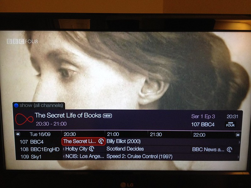
You try reading Helvetica Neue Light in the new TiVo EPG

A profusion of Helvetica Neue Light had invaded my Virgin TiVo box. According to industry observers, or more likely a regurgitated press release, the new TiVo UI has either a more refined, crisper, sharper or even a [new, more slender, curvier](http://www.expertreviews.co.uk/tvs-entertainment/1401351/plum-tivo-update-from-virgin-media-adds-new-features) font.

But what it really has is the very worst of Helvetica Neue Light in all its indistinct, tightly tracked, blurry mess. Yuck, if not actually ouch. This user on a [TiVO community forum](http://www.tivocommunity.com/tivo-vb/showthread.php?t=519022) puts it perfectly:

> UI hard to read – need the old font back! The new skinny font with letters jammed close together makes much of the UI unreadable to me from the couch across the room, I’ve never had a problem with it before but now I can barely read show info etc.

Compare with what the UI used to look like:


![Virgin Media screen shot](/images/oldtivo.jpg)
The previous Virgin Media TiVo interface

Perhaps the overall aesthetic needed a refresh, but the DIN-like font used in the UI was much more effective (and on [closer inspection](https://twitter.com/futuraprime/status/512614613016260608) turns out to be the Regular weight of Helvetica Neue Condensed). Distinct letter forms (for the most part) and compact dimensions make it a good choice, easily and comfortably readable from across the room.

And from what I can see, not only has Helvetica Neue Light been chosen, but it has been further tightened. Consider how “Billy Elliot” renders close up:


The scourge of Helvetica Neue Light

Now imagine the mess you get from 3 metres away. At best you get “Bllly Elllot”, but in reality all you see is a smudge inbetween some consonants.


![Various renderings of ‘Billy Elliot’ in Helvetica](/images/billyelliot.png)

At the top of the preceding image you can see plain old Helvetica Light with its slightly more compact letter forms (look at the B and the o in particular) and more generous letter spacing. Below that is Helvetica Neue Light, a slightly worse choice with its tighter letter spacing. Then you have Helvetica Neue Light as further tightened in the TiVo user interface, further smudged by my television.

No-one ever got fired for using Helvetica Neue Light? Maybe they should when it gets used like this.

Read or add comments


List of pangrams

$
0
0

As [Mark tweeted](https://twitter.com/markboulton/status/527874228356673536) today, there used to be [a page on Wikipedia listing pangrams](http://en.wikipedia.org/wiki/List_of_pangrams) in various languages. [This was deleted](http://en.wikipedia.org/wiki/Wikipedia:Articles_for_deletion/List_of_pangrams) yesterday for the kind of reasons that only Wikipedians have (It is mostly comprised of nonsense phrases thought up by people who apparently find this sort of thing terribly clever).

Pangrams are words or sentences containing every letter of the alphabet at least once; the best known English example being A quick brown fox jumps over the lazy dog. As well as containing some rather amusing gems, the pangrams in languages other than English can be occasionally useful for designers of all sorts. For that reason I have resurrected the page of pangrams here, pretty much as it was in Wikipedia.


Contents


Perfect pangrams in English (26 letters)[edit]


Without abbreviations, acronyms, contractions, initialisms, isolated letters, proper nouns, Roman numerals[edit]


  • Cwm fjord veg balks nth pyx quiz. (Relaxing in basins at the end of inlets terminates the endless tests from the box.)
  • Cwm fjord bank glyphs vext quiz. (Carved symbols in a mountain hollow on the bank of an inlet irritated an eccentric person.)[1]
  • Jink cwm, zag veldt, fob qursh pyx. (Cross valley and plain to steal coins from Saudi mint. – created by Stephen Wagner)
  • Junky qoph-flags vext crwd zimb. (An Abyssinian fly playing a Celtic violin was annoyed by trashy flags on which were the Hebrew letter qoph.)
  • Squdgy fez, blank jimp crwth vox! (A short brimless felt hat barely blocks out the sound of a Celtic violin. – created by Claude Shannon)
  • Veldt jynx grimps waqf zho buck (A grass-plains wryneck climbs upon a male yak-cattle hybrid that was donated under Islamic law.)
  • Bortz waqf glyphs vex muck djin. (Signage indicating endowments for industrial diamonds annoy filth-spreading genies. – created by Ed Spargo)

With abbreviations, acronyms, initialisms or proper nouns, all restricted to dictionary words[edit]


  • Jumbling vext frowzy hacks PDQ. (Being bounced around quickly annoyed the disheveled taxi drivers. – all words in high school dictionary)
  • PR flacks quiz gym: TV DJ box when? (Public relations agent asks sports room, when do television disc jockeys fight?)
  • Zing, dwarf jocks vex lymph, Qutb. (Making a high-pitched sound, short athletes annoy their white blood plasma and an Islamic saint. – created by Peter M. Lella)
  • Zing, vext cwm fly jabs Kurd qoph. (Making a high-pitched sound, annoyed mountain basin insect sticks Hebrew letter.)
  • Kat veld zubr gif cwm jynx qophs. (European bison of a shrubby African plain make digital image files of Semitic letters from valley wrynecks. – discovered by Da-Shih Hu)

With abbreviations, acronyms, contractions, initialisms, isolated letters, proper nouns, Roman Numerals and not restricted to Dictionary Words[edit]


  • A zenith of Xvurj’s cwm KL Gybdq
  • Zombies play crwth, quj FDG xvnk
  • Blowzy night-frumps vex’d Jack Q.
  • Dwarf mobs quiz lynx.jpg, kvetch! (Crowd of midgets question picture of wildcat, then complain.)
  • Frowzy things plumb vex’d Jack Q.
  • G.B. fjords vex quick waltz nymph.
  • Glum Schwartzkopf vex’d by NJ IQ.
  • Gym DJ Beck vows phiz tranq flux. (Beck, the gymnasium DJ, promises a change in facial tranquilizers.)
  • Jerk gawps foxy Qum Blvd. chintz.
  • JFK got my VHS, PC and XLR web quiz.
  • Jocks find quartz glyph, vex BMW.
  • J.Q. Vandz struck my big fox whelp.
  • J.Q. Schwartz flung D.V. Pike my box.
  • Jump dogs, why vex Fritz Blank QC?
  • Mr. Jock, TV quiz PhD, bags few lynx.
  • New job: fix Mr. Gluck’s hazy TV, PDQ! (includes 5 punctuation symbols)
  • Quartz glyph job vex’d cwm finks. (The act of carving symbols into quartz irritated ruffians from a Welsh river valley.)
  • Quartz jock vends BMW glyph fix.
  • The glib czar junks my VW Fox PDQ.

Longer pangrams in English (in order of fewest letters used)[edit]


  • Nymphs blitz quick vex dwarf jog. (27 letters)
  • DJs flock by when MTV ax quiz prog. (27 letters) (2 acronyms, 1 abbreviation and a US spelling)
  • Big fjords vex quick waltz nymph. (27 letters)
  • Bawds jog, flick quartz, vex nymph. (27 letters)
  • Waltz job vexed quick frog nymphs. (28 letters) (new variation on 29 letter version)
  • Junk MTV quiz graced by fox whelps. (28 letters) (Includes abbreviation)
  • Bawds jog, flick quartz, vex nymphs. (28 letters)
  • Waltz, bad nymph, for quick jigs vex! (28 letters)
  • Waltz, nymph, for quick jigs vex Bud! (28 letters) (Includes proper noun)
  • Fox nymphs grab quick-jived waltz. (28 letters)
  • Brick quiz whangs jumpy veldt fox. (28 letters)
  • Glib jocks quiz nymph to vex dwarf. (28 letters)
  • Bright vixens jump; dozy fowl quack. (29 letters)
  • Vexed nymphs go for quick waltz job. (29 letters)
  • Quick wafting zephyrs vex bold Jim. (29 letters) (Includes proper noun)
  • Quick zephyrs blow, vexing daft Jim. (29 letters) (Includes proper noun)
  • Quick blowing zephyrs vex daft Jim. (29 letters) (Includes proper noun)
  • Sphinx of black quartz, judge my vow! (29 letters) (Used by Adobe InDesign when providing samples of all fonts.)
  • Sex-charged fop blew my junk TV quiz. (29 letters) (Includes abbreviation)
  • Both fickle dwarves jinx my pig quiz. (30 letters)
  • Fat hag dwarves quickly zap jinx mob. (30 letters)
  • Hick dwarves jam blitzing foxy quip. (30 letters)
  • Fox dwarves chop my talking quiz job. (30 letters)
  • Public junk dwarves quiz mighty fox. (30 letters)
  • Jack fox bids ivy-strewn phlegm quiz. (30 letters) (Includes proper noun)
  • How quickly daft jumping zebras vex. (30 letters)
  • Two driven jocks help fax my big quiz. (30 letters)
  • “Now fax quiz Jack!” my brave ghost pled. (30 letters) (Includes proper noun)
  • Jack, love my big wad of sphinx quartz! (30 letters) (Includes proper noun)
  • Do wafting zephyrs quickly vex Jumbo? (31 letters) (Includes proper noun)
  • Go, lazy fat vixen; be shrewd, jump quick. (31 letters)
  • Fickle jinx bog dwarves spy math quiz. (31 letters)
  • Big dwarves heckle my top quiz of jinx. (31 letters)
  • Fickle bog dwarves jinx empathy quiz. (31 letters)
  • Public junk dwarves hug my quartz fox. (31 letters)
  • Jumping hay dwarves flock quartz box. (31 letters)
  • Five jumping wizards hex bolty quick. (31 letters)
  • Five hexing wizard bots jump quickly. (31 letters)
  • Quick fox jumps nightly above wizard. (31 letters)
  • Vamp fox held quartz duck just by wing. (31 letters)
  • Five quacking zephyrs jolt my wax bed. (31 letters) (Used by Mac OS X when previewing TrueType fonts.)
  • The five boxing wizards jump quickly. (31 letters) (Used by XXDiff as sample text)
  • Jackdaws love my big sphinx of quartz. (31 letters) (Used by Microsoft Windows XP when previewing some non-TrueType/OpenType fonts. It is interesting that the set of digits afterwards omits the numeral 7.)
  • Show mangled quartz flip vibe exactly. (32 letters)
  • My jocks box, get hard, unzip, quiver, flow. (32 letters)
  • Kvetching, flummoxed by job, W. zaps Iraq. (32 letters) (Includes proper nouns)
  • My ex pub quiz crowd gave joyful thanks. (32 letters)
  • Cozy sphinx waves quart jug of bad milk. (32 letters)
  • A very bad quack might jinx zippy fowls. (32 letters) (Contains all 26 letters in lower case)
  • Pack my box with five dozen liquor jugs. (32 letters) (Used for font samples in the catalog of the Kelsey Press Company, by Beagle Bros and in Space Shuttle; featured in Ella Minnow Pea)
  • Few quips galvanized the mock jury box. (32 letters)
  • Quick brown fox jumps over the lazy dog. (32 letters) (Not attested as frequently as the traditional, and better-formed, The quick brown fox…, below)
  • Quilt frenzy jackdaw gave them best pox. (33 letters)
  • Jumpy halfling dwarves pick quartz box. (33 letters)
  • Schwarzkopf vexed Iraq big-time in July. (33 letters) (Includes proper nouns)
  • Vex quest wizard, judge my backflop hand. (33 letters)
  • The jay, pig, fox, zebra and my wolves quack! (33 letters)
  • Blowzy red vixens fight for a quick jump. (33 letters)
  • Sex prof gives back no quiz with mild joy. (33 letters) (Includes abbreviation)
  • The quick brown fox jumps over a lazy dog. (33 letters) (A variant of the better-known, but longer, version with the in place of a, below.)
  • A quick brown fox jumps over the lazy dog. (33 letters) (This variation contains all 26 letters in lower case)
  • Quest judge wizard bonks foxy chimp love. (34 letters)
  • Boxers had zap of gay jock love, quit women. (34 letters, each consonant used only once)
  • Joaquin Phoenix was gazed by MTV for luck. (34 letters) (Includes proper nouns and abbreviation)
  • JCVD might pique a sleazy boxer with funk.[2] (34 letters) (Includes abbreviation of proper noun)
  • Quizzical twins proved my hijack-bug fix. (34 letters)
  • Fix problem quickly with galvanized jets. (35 letters)
  • The quick brown fox jumps over the lazy dog. (35 letters) (Used to test typewriters and computer keyboards, and as sample text; famous for its coherency, dating back to 1888. Sometimes erroneously quoted with “jumped”, omitting the letter s.)
  • Waxy and quivering, jocks fumble the pizza. (35 letters)
  • When zombies arrive, quickly fax judge Pat. (35 letters) (Includes proper noun)
  • Heavy boxes perform quick waltzes and jigs. (36 letters)
  • A wizard’s job is to vex chumps quickly in fog. (36 letters)
  • Sympathizing would fix Quaker objectives. (36 letters) (Includes proper noun)
  • Pack my red box with five dozen quality jugs. (36 letters)
  • BlewJ’s computer quiz favored proxy hacking. (37 letters) (Includes proper noun)
  • Quads of blowzy fjord ignite map vex’d chicks. (37 letters)
  • Fake bugs put in wax jonquils drive him crazy. (37 letters)
  • Watch “Jeopardy!”, Alex Trebek’s fun TV quiz game. (37 letters) (Includes proper nouns and abbreviation)
  • GQ jock wears vinyl tuxedo for showbiz promo. (37 letters) (Includes abbreviation)
  • The quick brown fox jumped over the lazy dogs. (37 letters)
  • Who packed five dozen old quart jugs in my box? (37 letters)
  • Woven silk pyjamas exchanged for blue quartz. (38 letters) (Used for font samples by Scribus)
  • Brawny gods just flocked up to quiz and vex him. (38 letters)
  • Twelve ziggurats quickly jumped a finch box. (38 letters)
  • Prating jokers quizzically vexed me with fibs. (39 letters)
  • My faxed joke won a pager in the cable TV quiz show. (39 letters) (Includes abbreviation)
  • The quick onyx goblin jumps over the lazy dwarf. (39 letters) (From flavor text in a card in the Magic: the Gathering card game[3])
  • The lazy major was fixing Cupid’s broken quiver. (39 letters) (Includes proper noun)
  • Amazingly few discotheques provide jukeboxes. (40 letters) (only 5 words – fewer than all others in this list)
  • Jacky can now give six big tips from the old quiz. (40 letters)
  • Lovak won the squad prize cup for sixty big jumps. (40 letters)
  • J. Fox made five quick plays to win the big prize. (40 letters)
  • Foxy diva Jennifer Lopez wasn’t baking my quiche. (41 letters) (Includes proper noun)
  • Cozy lummox gives smart squid who asks for job pen. (41 letters) (Used for font samples by the Macintosh, post-System 7, as well as on certain Palm products)
  • By Jove, my quick study of lexicography won a prize. (41 letters) (Includes proper noun)
  • Levi Lentz packed my bag with six quarts of juice. (41 letters)
  • Painful zombies quickly watch a jinxed graveyard. (42 letters)
  • Fax back Jim’s Gwyneth Paltrow video quiz. (42 letters) (Includes proper nouns)
  • As quirky joke, chefs won’t pay devil magic zebra tax. (42 letters)
  • My girl wove six dozen plaid jackets before she quit. (43 letters)
  • Then a cop quizzed Mick Jagger’s ex-wives briefly. (43 letters) (Includes proper noun)
  • Six big devils from Japan quickly forgot how to waltz. (44 letters) (Includes proper noun)
  • “Who am taking the ebonics quiz?”, the prof jovially axed. (44 letters)
  • Why shouldn’t a quixotic Kazakh vampire jog barefoot? (44 letters) (Includes proper noun)
  • Grumpy wizards make a toxic brew for the jovial queen. (44 letters)
  • Sixty zips were quickly picked from the woven jute bag. (45 letters)
  • Big July earthquakes confound zany experimental vow. (45 letters) (Includes proper noun)
  • Foxy parsons quiz and cajole the lovably dim wiki-girl. (45 letters)
  • Cute, kind, jovial, foxy physique, amazing beauty? Wowser! (45 letters)
  • Have a pick: twenty-six letters — no forcing a jumbled quiz! (46 letters)
  • A very big box sailed up then whizzed quickly from Japan. (46 letters)
  • Battle of Thermopylae: Quick javelin grazed wry Xerxes. (46 letters) (Includes proper nouns)
  • Jack quietly moved up front and seized the big ball of wax. (47 letters) (Includes proper noun)
  • Few black taxis drive up major roads on quiet hazy nights. (47 letters)
  • Just poets wax boldly as kings and queens march over fuzz. (47 letters)
  • Bored? Craving a pub quiz fix? Why, just come to the Royal Oak! (47 letters) (Used to advertise a pub quiz in Bowness-on-Windermere)
  • Quincy Pondexter blocked five jams against the Wizards! (47 letters) (Includes proper nouns)
  • Crazy Frederick bought many very exquisite opal jewels. (48 letters) (Includes proper noun)
  • A quivering Texas zombie fought republic linked jewelry. (48 letters) (Includes proper noun)
  • Grumpy wizards make toxic brew for the evil queen and jack. (48 letters) (Used by Google Fonts)
  • The job of waxing linoleum frequently peeves chintzy kids. (49 letters)
  • Back in June we delivered oxygen equipment of the same size. (49 letters) (Includes proper noun)
  • Just keep examining every low bid quoted for zinc etchings. (49 letters) (Used in many type specimen books for letterpress printers)
  • How razorback-jumping frogs can level six piqued gymnasts! (49 letters) (Used for font samples by the Macintosh, System 7 era)
  • A quick movement of the enemy will jeopardize six gunboats. (49 letters)
  • All questions asked by five watched experts amaze the judge. (49 letters)
  • Bobby Klun awarded Jayme sixth place for her very high quiz. (50 letters)
  • The wizard quickly jinxed the gnomes before they vaporized. (50 letters)
  • Zelda might fix the job growth plans very quickly on Monday. (50 letters)
  • Zack Gappow saved the job requirement list for the six boys. (50 letters)
  • Jackie will budget for the most expensive zoology equipment. (51 letters)
  • Quirky spud boys can jam after zapping five worthy Polysixes. (51 letters) (Includes proper noun)
  • Jim quickly realized that the beautiful gowns are expensive. (51 letters)

English phonetic pangrams[edit]


Pangrams which use all the phonemes, or phones, of English (rather than alphabetic characters):


  • “With tenure, Suzie’d have all the more leisure for yachting, but her publications are no good.” (for certain US accents and phonological analyses)
  • “Shaw, those twelve beige hooks are joined if I patch a young, gooey mouth.” (perfect for certain accents with the cot-caught merger)
  • “Are those shy Eurasian footwear, cowboy chaps, or jolly earthmoving headgear?” (perfect for certain Received Pronunciation accents)
  • “The beige hue on the waters of the loch impressed all, including the French queen, before she heard that symphony again, just as young Arthur wanted.” (a phonetic, not merely phonemic, pangram. It contains both nasals [m] and [ɱ] (as in ‘symphony’), the fricatives [x] (as in ‘loch’) and [ç] (as in ‘hue’), and the ‘dark L’ [ɫ] (as in ‘all’) – in other words, it contains different allophones.)

Other languages[edit]


Arabic[edit]


  • صِف خَلقَ خَودِ كَمِثلِ الشَمسِ إِذ بَزَغَت — يَحظى الضَجيعُ بِها نَجلاءَ مِعطارِ (A poem by Al Farāhīdi)
  • هلا سكنت بذي ضغثٍ فقد زعموا — شخصت تطلب ظبياً راح مجتازا
  • اصبر على حفظ خضر واستشر فطنا، وزج همك في بغداذ منثملا
  • نصٌّ حكيمٌ لهُ سِرٌّ قاطِعٌ وَذُو شَأنٍ عَظيمٍ مكتوبٌ على ثوبٍ أخضرَ ومُغلفٌ بجلدٍ أزرق

    naṣun ḥakymun lahu syrun qāṭiʿun wa ḏu šānin ʿẓymin maktubun ʿala ṯubin aẖḍra wa muġalafun biǧildin azraq

    • A wise text which has an absolute secret and great importance, written on a green cloth and covered with blue leather (it has a riddle built into it)

  • ابجد هوز حطي كلمن سعفص قرشت ثخذ ضظغ

أبجد هوز ترتيب الحروف العبرية والعربية من اللغات الساميَّة


Azeri[edit]


  • Zəfər, jaketini də papağını da götür, bu axşam hava çox soyuq olacaq.

    • Zafer (male name), take your jacket and cap, it will be very cold tonight.

Breton[edit]


  • Yec’hed mat Jakez ! Skarzhit ar gwerennoù-mañ, kavet e vo gwin betek fin ho puhez.

Bulgarian[edit]


  • Ах чудна българска земьо, полюшвай цъфтящи жита.

    • Ah, wonderful Bulgarian land, shake the blooming wheat fields.

  • Жълтата дюля беше щастлива, че пухът, който цъфна, замръзна като гьон.

    • The yellow quince was happy that the fluff which bloomed froze like sole-leather.

  • За миг бях в чужд плюшен скърцащ фотьойл. (Used for font samples by the Macintosh, in the localized System 7)

    • For a moment I was in someone else’s plush squeaking armchair.

  • Вкъщи не яж сьомга с фиде без ракийка и хапка люта чушчица!

    • At home, do not eat salmon with soup noodles without rakia and a bit of hot paprika!

  • Под южно дърво, цъфтящо в синьо, бягаше малко пухкаво зайче.

    • Under a southern tree, blooming in blue, ran a little fluffy bunny.

  • Шугав льохман, държащ птицечовка без сейф и ютия.

    • A mangy lummox, holding a platypus without a safe and flat iron.

  • Я, пазачът Вальо уж бди, а скришом хапва кюфтенца зад щайгите.

    • Why, Valyo the guard is supposed to be watching, and yet he’s secretly eating meatballs behind the crates.

  • Хълцайки много, въздесъщият позьор, Юрий жабока, фучеше.

    • Hiccuping intensely, the famous poseur, Yuri the frog, was sputtering.

  • Гномът Доцьо приключи спящ в шейна за жаби.

    • Dotsyo the Gnome ended up sleeping in a carriage for frogs.

  • Щиглецът се яде само пържен в юфка без чушки и хвойна.

    • Goldfinch is only eaten fried with noodles, without peppers and juniper.

  • Фучейки и хълцайки, кьоравият грухтящ шопар жадно стъпка зюмбюлите

    • Snorting and whimpering, the grunting blind boar hungrily trampled the hyacinths.

  • Хълцащ змей плюе шофьор стигнал чуждия бивак.

    • A hiccuping dragon spits at a driver who has reached someone else’s campsite.

  • Щурчо Цоньо хапваше ловджийско кюфте с бяла гъмза.

    • Tsonyo the cricket was eating a hunter-style meatball with white Gamza wine.

Catalan[edit]


  • (with all letters and diacritics) «Dóna amor que seràs feliç!». Això, il·lús company geniüt, ja és un lluït rètol blavís d’onze kWh.

    • “Give love and you’ll be happy!”. This, ingenuous fellow with bad temper, is already in a blue sign of 11kWh.

  • (with ç) Jove xef, porti whisky amb quinze glaçons d’hidrogen, coi!

    • Young chef, bring whisky with fifteen hydrogen ice cubes, darn!

  • Aqueix betzol, Jan, comprava whisky de figa

    • That idiot, Jan, was buying fig whisky

  • Zel de grum: quetxup, whisky, cafè, bon vi; ja!
  • Coi! quinze jans golafres de Xàtiva, beuen whisky a pams

Cherokee[edit]


  • ᎠᏍᎦᏯᎡᎦᎢᎾᎨᎢᎣᏍᏓᎤᎩᏍᏗᎥᎴᏓᎯᎲᎢᏔᎵᏕᎦᏟᏗᏖᎸᎳᏗᏗᎧᎵᎢᏘᎴᎩ ᏙᏱᏗᏜᏫᏗᏣᏚᎦᏫᏛᏄᏓᎦᏝᏃᎠᎾᏗᎭᏞᎦᎯᎦᏘᏓᏠᎨᏏᏕᏡᎬᏢᏓᏥᏩᏝᎡᎢᎪᎢ ᎠᎦᏂᏗᎮᎢᎫᎩᎬᏩᎴᎢᎠᏆᏅᏛᎫᏊᎾᎥᎠᏁᏙᎲᏐᏈᎵᎤᎩᎸᏓᏭᎷᏤᎢᏏᏉᏯᏌᏊ ᎤᏂᏋᎢᏡᎬᎢᎰᏩᎬᏤᎵᏍᏗᏱᎩᎱᎱᎤᎩᎴᎢᏦᎢᎠᏂᏧᏣᏨᎦᏥᎪᎥᏌᏊᎤᎶᏒᎢᎢᏡᎬᎢ ᎹᎦᎺᎵᏥᎻᎼᏏᎽᏗᏩᏂᎦᏘᎾᎿᎠᏁᎬᎢᏅᎩᎾᏂᎡᎢᏌᎶᎵᏎᎷᎠᏑᏍᏗᏪᎩ ᎠᎴ ᏬᏗᏲᏭᎾᏓᏍᏓᏴᏁᎢᎤᎦᏅᏮᏰᎵᏳᏂᎨᎢ.

Croatian[edit]


  • Gojazni đačić s biciklom drži hmelj i finu vatu u džepu nošnje. (Used by Microsoft Office as sample text for Croatian language.)

    • The overweight little schoolboy with a bike is holding hops and fine cotton in the pocket of his attire.

Czech[edit]


  • Nechť již hříšné saxofony ďáblů rozezvučí síň úděsnými tóny waltzu, tanga a quickstepu. (All 42 letters of the Czech alphabet, 72 letters in total)

    • Let the sinful saxophones of devils finally make the hall resonate with the frightful tones of waltz, tango and quickstep.

  • Příliš žluťoučký kůň úpěl ďábelské ódy. (All the non-ASCII letters of the Czech alphabet – popular sentence for character sets testing)

    • Unduly yellowish horse was groaning devilish odes.

  • Hleď, toť přízračný kůň v mátožné póze šíleně úpí.

    • Behold, tis the eerie horse in tottering affectation groaning like crazy.

  • Zvlášť zákeřný učeň s ďolíčky běží podél zóny úlů.

    • Particularly insidious apprentice with dimples is running along the zone of hives.

  • Loď čeří kýlem tůň obzvlášť v Grónské úžině.

    • A vessel ripples a pool by its keel, especially in the strait of Greenland.

  • Ó, náhlý déšť již zvířil prach a čilá laň teď běží s houfcem gazel k úkrytům.

    • Oh, sudden rain has already whirled the dust and a spry doe now gallops with a flock of gazelles for the shelter.

Danish[edit]


  • (Each letter exactly once) Høj bly gom vandt fræk sexquiz på wc

    • Tall shy groom won dirty sex quiz on W.C.

  • Quizdeltagerne spiste jordbær med fløde, mens cirkusklovnen Walther spillede på xylofon.

    • The quiz contestants ate strawberry with cream while Walter the circus clown played the xylophone.

Dzongkha[edit]


  • ཨ་ཡིག་དཀར་མཛེས་ལས་འཁྲུངས་ཤེས་བློའི་གཏེར༎ ཕས་རྒོལ་ཝ་སྐྱེས་ཟིལ་གནོན་གདོང་ལྔ་བཞིན༎ ཆགས་ཐོགས་ཀུན་བྲལ་མཚུངས་མེད་འཇམ་དབྱངསམཐུས༎ མཧཱ་མཁས་པའི་གཙོ་བོ་ཉིད་འགྱུར་ཅིག།

Esperanto[edit]


  • Eble ĉiu kvazaŭ-deca fuŝĥoraĵo ĝojigos homtipon.

    • Maybe every quasi-fitting bungle-choir makes a human type happy.

  • Laŭ Ludoviko Zamenhof bongustas freŝa ĉeĥa manĝaĵo kun spicoj.

    • According to Ludwig Zamenhof, fresh Czech food with spices tastes good.

Estonian[edit]


  • Põdur Zagrebi tšellomängija-följetonist Ciqo külmetas kehvas garaažis

    • Ill-healthy cellist-feuilletonist Ciqo from Zagreb was being cold in a poor garage. (used in KDE font selection).

  • See väike mölder jõuab rongile hüpata

    • This small miller is able to jump to train (used in localized version of Microsoft Word in Office XP, contains all non-foreign letters)

  • Jubedalt möirgav lõukoer hüppas tänaval

    • Terribly roaring lion jumped on street

Finnish[edit]


  • (A perfect pangram which does not include characters only found in foreign or loanwords (b, c, f, q, w, x, z, å)): Törkylempijävongahdus

    • Muckysnogger booty-call.

  • (Without the foreign characters c, q, x, z, w, å) Albert osti fagotin ja töräytti puhkuvan melodian.

    • Albert bought a bassoon and blasted a puffing melody. (used in older versions of Word Perfect).

  • (Without the foreign characters b, c, f, q, w, x, z, å) Lorun sangen pieneksi hyödyksi jäivät suomen kirjaimet.

    • The quite small benefit of the rhyme was the letters of Finnish.

  • Hyvän lorun sangen pieneksi hyödyksi jäi suomen kirjaimet.

    • Modification of the previous one where the first letter is repeated (in the case the capital first letter is used but all the small letters are needed): The quite small benefit of the good rhyme was the letters of Finnish.

  • (All characters, including foreign ones): Fahrenheit ja Celsius yrjösivät Åsan backgammon-peliin, Volkswagenissa, daiquirin ja ZX81:n yhteisvaikutuksesta.

    • Fahrenheit and Celsius threw up on Åsa’s Backgammon board, in a Volkswagen, due to the coeffect of daiquiri and a ZX81.

  • (All characters, including foreign ones): Charles Darwin jammaili Åken hevixylofonilla Qatarin yöpub Zeligissä.

    • Charles Darwin was jamming on Åke’s heavy metal xylophone in the Qatar night pub Zelig.

  • (All characters, including foreign ones): Wieniläinen sioux’ta puhuva ökyzombie diggaa Åsan roquefort-tacoja.

    • The Sioux-speaking filthy rich zombie from Vienna digs Åsa’s Roquefort tacos.

French[edit]


  • Buvez de ce whisky que le patron juge fameux. (36)

    • Drink some of this whisky which the boss finds excellent.

  • Portez ce vieux whisky au juge blond qui fume

    • Take this old whisky to the blond smoking judge

  • Portez ce vieux whisky au juge blond qui a fumé. (variant with “é”)

    • Take this old whisky to the blond judge who has smoked.

  • Bâchez la queue du wagon-taxi avec les pyjamas du fakir

    • Tarpaulin up the taxi-railcar tail with the fakir’s pajamas

  • Voyez le brick géant que j’examine près du wharf

    • See the giant brig which I examine near the wharf

  • Voix ambiguë d’un cœur qui au zéphyr préfère les jattes de kiwi

    • Ambiguous voice of a heart which prefers kiwi bowls to a zephyr

  • Monsieur Jack, vous dactylographiez bien mieux que votre ami Wolf

    • Mister Jack, you typed much better than your friend Wolf [was used in the Swiss army to check the keyboard of typewriters before teletransmission]

West Frisian[edit]


  • Alve bazige froulju wachtsje op dyn komst

    • Eleven bossy women await your arrival

German[edit]


  • (no umlauts or ß): Sylvia wagt quick den Jux bei Pforzheim

    • Sylvia dares quickly the joke near Pforzheim

  • (no umlauts or ß): Franz jagt im komplett verwahrlosten Taxi quer durch Bayern

    • Franz chases in the completely shabby cab straight through Bavaria

  • (with umlauts and ß): Victor jagt zwölf Boxkämpfer quer über den großen Sylter Deich

    • Victor chases twelve boxers across the great dam of Sylt

  • (with umlauts and ß, each letter exactly once, according to the pre-1996 spelling rules): “Fix, Schwyz!” quäkt Jürgen blöd vom Paß

    • “Quick, Schwyz!” Jürgen squawks zanily from the pass

  • “Falsches Üben von Xylophonmusik quält jeden größeren Zwerg” (used by KDE)

    • Wrong practising of xylophone music bothers every larger dwarf

Greek[edit]


Hebrew[edit]


  • דג סקרן שט בים מאוכזב ולפתע מצא חברה

    dg sqrn šṭ bjM mʾwkzb wlptʿ mṣʾ ḥbrh

    • (A curious fish sailed the sea disappointedly, and suddenly found company)

  • כך התרסק נפץ על גוזל קטן, שדחף את צבי למים

    kk htrsq np ʿl gwzl qṭn, šdḥp ʾt ṣbj lmjm

    • An explosive crashed into a small chick, which pushed my deer into the water. (Includes all medial and final forms, here indicated by bold letters.)

  • שפן אכל קצת גזר בטעם חסה, ודי.

    špn ʾkl qṣt gzr bṭʿm ḥsh, wdj

    • (A hyrax ate some lettuce flavored carrot and that’s it)
    • Each letter occurs exactly once.

  • עטלף אבק נס דרך מזגן שהתפוצץ כי חם

    • (A “dust bat” escaped through the air conditioner, which exploded due to the heat)
    • All 22 in the Hebrew alphabet with all medial and final forms

  • או הנסה אלהים, לבוא לקחת לו גוי מקרב גוי, במסת באתת ובמופתים ובמלחמה וביד חזקה ובזרוע נטויה, ובמוראים גדלים: ככל אשר-עשה לכם יהוה אלהיכם, במצרים—לעיניך (Deuteronomy 4:34)
  • לכן חכו לי נאם יהוה ליום קומי לעד, כי משפטי לאסף גוים לקבצי ממלכות, לשפך עליהם זעמי כל חרון אפי, כי באש קנאתי תאכל כל הארץ (Zephaniah 3:8 – the only verse in the Hebrew Bible that contains all medial forms of the letters plus all final forms)

Hindi[edit]


  • ऋषियों को सताने वाले दुष्ट राक्षसों के राजा रावण का सर्वनाश करने वाले विष्णुवतार भगवान श्रीराम, अयोध्या के महाराज दशरथ के बड़े सपुत्र थे।

Hungarian[edit]


  • Jó foxim és don Quijote húszwattos lámpánál ülve egy pár bűvös cipőt készít.

    • My good foxterrier and don Quixote are making a pair of magic shoes by a 20-watt lamp.

  • Árvíztűrő tükörfúrógép

    • A flood-resistant mirror drill

Icelandic[edit]


  • Kæmi ný öxi hér, ykist þjófum nú bæði víl og ádrepa.

    • If a new axe were here, thieves would feel increasing deterrence and punishment.

  • (each letter exactly once): Svo hölt, yxna kýr þegði jú um dóp í fé á bæ.

    • A cow in heat with such a limp would admittedly keep silent about drugs in sheep on a farm.

  • (each letter exactly once, with z (obsolete spelling)): Þú dazt á hnéð í vök og yfir blóm sexý pæju.

    • You fell on the knee in a hole in the ice and over a sexy girl’s flower.

Igbo[edit]


  • Nne, nna, wepụ he’l’ụjọ dum n’ime ọzụzụ ụmụ, vufesi obi nye Chukwu, ṅụrịanụ, gbakọọnụ kpaa, kwee ya ka o guzoshie ike; ọ ghaghị ito, nwapụta ezi agwa. (all 36 letters and diacritics).

Indonesian[edit]


  • Muharjo seorang xenofobia universal yang takut pada warga jazirah, contohnya Qatar.

    • Muharjo is a universal xenophobic who fears the peninsula residents, such as Qatar.

  • Saya lihat foto Hamengkubuwono XV bersama enam zebra purba cantik yang jatuh dari Alquranmu.

    • I saw a photo of Hamengkubuwono XV along with six beautiful ancient zebra which fell from your Koran.

  • Hafiz mengendarai bajaj payah-payah ke warnet-x untuk mencetak lembar verifikasi dalam kertas quarto.

Irish[edit]


  • D’fhuascail Íosa Úrmhac na hÓighe Beannaithe pór Éava agus Ádhaimh
  • D’ḟuascail Íosa Úrṁac na hÓiġe Beannaiṫe pór Éaḃa agus Áḋaiṁ

    • Jesus, Son of the blessed Virgin, redeemed the seed of Eve and Adam.

  • Ċuaiġ bé ṁórṡáċ le dlúṫspád fíorḟinn trí hata mo ḋea-ṗorcáin ḃig

    • A greatly satisfied woman went with a truly white dense spade through the hat of my good little well-fattened pig (uses both regular and lenited (with dot above) letters)

Italian[edit]


Pangrams in Italian normally omit the foreign letters j, k, w, x, and y.


  • Quel fez sghembo copre davanti

    • That slanted fez covers the front.

  • Ma la volpe, col suo balzo, ha raggiunto il quieto Fido.

    • But the fox with her leap has reached the still Fido. [*”Fido” is a name commonly given to dogs.*]

  • Quel vituperabile xenofobo zelante assaggia il whisky ed esclama: alleluja!

    • That blameworthy, zealous xenophobe tastes his whisky and exclaims: Alleluja!

  • Pranzo d’acqua fa volti sghembi.

    • Lunch of water makes lopsided faces.

  • O templi, quarzi, vigne, fidi boschi!

    • O temples, quartzes, vines, faithful woods!

  • Che tempi brevi, zio, quando solfeggi.

    • Such short times, uncle, when you sol-fa.

  • Qualche notizia pavese mi fa sbadigliare.

    • Some news from Pavia makes me yawn.

  • In quel campo si trovan funghi in abbondanza.

    • In that field, mushrooms are to be found in abundance.

  • Qualche vago ione tipo zolfo, bromo, sodio.

    • Some vague ions, like sulfur, bromine, sodium.

  • Berlusconi? Quiz, tv, paghe da fame. (Umberto Eco)[4]
  • Tv? Quiz, Br, Flm, Dc… Oh, spenga! (Umberto Eco, 1979, without foreign letters)

Japanese[edit]


Since there are tens of thousands of kanji characters, Japanese pangrams are ones containing all kana.


  • Iroha Uta

    • いろはにほへと ちりぬるを わかよたれそ つねならむ うゐのおくやま けふこえて あさきゆめみし ゑひもせす(ん)

      irohanihoheto chirinuruwo wakayotareso tsunenaramu uwinookuyama kefukoete asakiyumemishi yehimosesu(n)

    • 色は匂へど 散りぬるを 我が世誰ぞ 常ならむ 有為の奥山 今日越えて 浅き夢見じ 酔ひもせず(ん)
    • * The poem Iroha uses all 47 classical kana characters exactly once, and it comes in the form of a poem. (The characters and are obsolete in modern Japanese.) Iroha is so classically entrenched that any modern construction of a Japanese pangram in classical form is called iroha-uta.

  • Tori Naku Uta

    • とりなくこゑす ゆめさませ みよあけわたる ひんかしを そらいろはえて おきつへに ほふねむれゐぬ もやのうち

      torinakukowesu yumesamase miyoakewataru hinkashiwo sorairohaete okitsuheni hofunemurewinu moyanōchi.

    • 鳥啼く声す 夢覚ませ 見よ明け渡る 東を 空色栄えて 沖つ辺に 帆船群れゐぬ 靄の中
    • * Awaken from dreaming to the voice of the crying bird and see the coming daylight turning the east sky-blue; shrouded in mist is a flock of ships on the open sea

  • Ametsuchi No Uta

    • あめ つち ほし そら / やま かは みね たに / くも きり むろ こけ / ひと いぬ うへ すゑ / ゆわ さる おふ せよ / えのえを なれ ゐて
    • 天 地 星 空 / 山 川 峰 谷 / 雲 霧 室 苔 / 人 犬 上 末 / 硫黄 猿 生ふ 為よ / 榎の 枝を 馴れ 居て

  • Taini no Uta

    • たゐにいて なつむわれをそ きみめすと あさりおひゆく やましろの うちゑへるこら もはほせよ えふねかけぬ
    • 田居に出で 菜摘むわれをぞ 君召すと 求食り追ひゆく 山城の 打酔へる子ら 藻葉干せよ え舟繋けぬ

Javanese[edit]


  • ꧋ ꦲꦤꦕꦫꦏ꧈ ꦢꦠꦱꦮꦭ꧈ ꦥꦝꦗꦪꦚ꧈ ꦩꦒꦧꦛꦔ꧉

    Hanacaraka, datasawala, padhajayanya, magabathanga.

    • There (were) two messengers; (they) had animosity (among each other); (they were) equally powerful (in fight); here are the corpses.

      • This poem is used as the ordering of the Javanese script.
      • This poem is a perfect pangram, which means there is only one instance of each letter.

Klingon[edit]


  •     

    qajunpaQHeylIjmo’ batlh DuSuvqang charghwI’ ‘It.

    • Because of your apparent audacity the depressed conqueror is willing to fight you.

Korean[edit]


  • 키스의 고유조건은 입술끼리 만나야 하고 특별한 기술은 필요치 않다.

    Kiseu-ui goyujogeoneun ipsulkkiri mannaya hago teukbyeolhan gisureun pilyochi antha.

    • The essential condition for a kiss is that lips meet and there is no special technique required.

      • In current usage, Hangul has 14 simple consonant letters, 6 simple vowel letters, and 4 iotized vowel letters; there are also 5 double consonant letters, 11 consonant clusters, and 11 diphthongs, made from combinations of the simple consonants or simple vowels. Of these, the above phrase contains all the simple consonant letters, simple vowel letters, and iotized vowel letters, along with 1 double consonant letter (ㄲ “gg”), 1 consonant cluster (ㄶ “nh”), and one diphthong (ㅢ “ui”).

Latin[edit]


  • Sic fugiens, dux, zelotypos, quam Karus haberis.[5]

    • Thus fleeing, O leader, you are regarded with jealousy like Karus.
    • Includes the letters k, y and z, used for words derived from Greek, but not the letters j, v or w, consonants that evolved from the vowels i and u.

Latvian[edit]


  • Muļķa hipiji mēģina brīvi nogaršot celofāna žņaudzējčūsku.

    • Silly hippies try to freely taste the cellophane python.

  • Glāžšķūņa rūķīši dzērumā čiepj Baha koncertflīģeļu vākus.

    • Glass shack gnomes steal Bach piano covers while inebriated.

  • Četri psihi faķīri vēlu vakarā zāģēja guļbūvei durvis, fonā šņācot mežam.

    • Late at night, four psycho conjurors were sawing the doors of a log cabin as the wind hummed in the background.

Lithuanian[edit]


  • Įlinkdama fechtuotojo špaga sublykčiojusi pragręžė apvalų arbūzą

    • Incurving fencer sword sparkled and perforated a round watermelon

Lojban[edit]


  • .o’i mu xagji sofybakni cu zvati le purdi

    • Watch out, five hungry Soviet-cows are in the garden!

Macedonian[edit]


  • Ѕидарски пејзаж: шугав билмез со чудење џвака ќофте и кељ на туѓ цех.

    • A mason’s landscape: a mangy fool wonderingly munches on meatball and kale at someone else’s expense.

  • Бучниов жолт џин ѕида куќа со фурна меѓу полиња за цреши, хмељ и грозје.

    • [This] noisy yellow giant is building a house with an oven in the midst of fields of cherries, hops and grapes.

  • Долг Џош, сторив женење, црн ѕид! Фрчат хмељ, ќумбе, ѓупки, зајак.

    • Long Josh, I’ve done a reaping, a black wall! Hops, Gypsy women, rabbit are whizzing.

  • Мојот дружељубив коњ со тих галоп фаќа брз џиновски глушец по туѓо ѕитче.

    • My friendly horse with a quiet gallop catches a quick giant mouse over someone else’s little wall.

Malayalam[edit]


  • അജവും ആനയും ഐരാവതവും ഗരുഡനും കഠോര സ്വരം പൊഴിക്കെ ഹാരവും ഒഢ്യാണവും ഫാലത്തില്‍ മഞ്ഞളും ഈറന്‍ കേശത്തില്‍ ഔഷധ എണ്ണയുമായി ഋതുമതിയും അനഘയും ഭൂനാഥയുമായ ഉമ ദുഃഖഛവിയോടെ ഇടതു പാദം ഏന്തി ങ്യേയാദൃശം നിര്‍ഝരിയിലെ ചിറ്റലകളെ ഓമനിക്കുമ്പോള്‍ ബാ‍ലയുടെ കണ്‍കളില്‍ നീര്‍ ഊര്‍ന്നു വിങ്ങി.

Mapudungun[edit]


The Ragileo alphabet doesn’t distinguish some sounds which are mostly used to convey affectionate speech variations, such as s/sh.


  • (Ragileo alphabet) Gvxam mincetu apocikvyeh: ñizol ce mamvj ka raq kuse bafkeh mew
  • (Unified alphabet) Ngütram minchetu apochiküyeṉ: ñidol che mamüll ka rag kushe ḻafkeṉ mew.
  • (Azümchefe) Gütxam minchetu apochiküyenh: ñizol che mamüll ka raq kushe lhafkenh mew.

    • Tale under the full moon: the chief chemamull and the clay old woman at the lake/sea.

Mongolian[edit]


  • Щётканы фермд пийшин цувъя. Бөгж зогсч хэльюү.

    • Let’s echelon fireplaces in brush farm. Ring says standing.

Myanmar[edit]


  • သီဟိုဠ်မှ ဉာဏ်ကြီးရှင်သည် အာယုဝဍ္ဎနဆေးညွှန်းစာကို ဇလွန်ဈေးဘေးဗာဒံပင်ထက် အဓိဋ္ဌာန်လျက် ဂဃနဏဖတ်ခဲ့သည်။

    • The genius from Sri Lanka read the formula of elixir of life thoroughly in the almond tree next to Zalun market.

Norwegian[edit]


Since Norwegian orthography does not include c, q, w, x or z, except in foreign borrowings that haven’t been naturalised, the possible pangrams including all the 29 letters of the Norwegian alphabet will require using two or more words with a distinctly foreign spelling.


  • Vår sære Zulu fra badeøya spilte jo whist og quickstep i min taxi.

    • Our strange Zulu from the bathing island actually played whist and quickstep in my taxi.

  • Høvdingens kjære squaw får litt pizza i Mexico by.

    • The chief’s dear squaw gets a little pizza in Mexico City.

  • IQ-løs WC-boms uten hørsel skjærer god pizza på xylofon.

    • IQ-less WC-bum without hearing cuts good pizza on xylophone.

  • Sær golfer med kølle vant sexquiz på wc i hjemby.

    • Strange golfer with club won sex quiz on W.C. in hometown.

  • Jeg begynte å fortære en sandwich mens jeg kjørte taxi på vei til quiz

    • I started to devour a sandwich while I was riding a taxi on the way to the quiz

Polish[edit]


Perfect pangrams (each letter exactly once):


  • Jeżu klątw, spłódź Finom część gry hańb! (by Stanisław Barańczak)

    • O hedgehog of curses, generate for the Finns a part of the game of ignominies!

  • Pójdźże, kiń tę chmurność w głąb flaszy!

    • Go, cast this melancholy into the depth of a bottle!

  • Mężny bądź, chroń pułk twój i sześć flag.

    • Be brave, protect your regiment and six flags.

  • Filmuj rzeź żądań, pość, gnęb chłystków!

    • Film the slaughter of demands, abstain from food, oppress the greenhorns!

  • Pchnąć w tę łódź jeża lub ośm skrzyń fig.

    • To push a hedgehog or eight crates of figs into this boat. (ośm – the original form of the numeral osiem)

  • Dość gróźb fuzją, klnę, pych i małżeństw!

    • “Enough of these threats with the shotgun,” swear I, “haughtinesses and marriages!”

  • Pójdź w loch zbić małżeńską gęś futryn!

    • Go to the dungeon to batter the marital goose of doorframes!

  • Chwyć małżonkę, strój bądź pleśń z fugi.

    • Seize your wife, the garment, or the mold from the grout.

Imperfect pangram:


  • Koń i żółw grali w kości z piękną ćmą u źródła.

    • A horse and a tortoise played dice with a beautiful moth near the spring.

Portuguese[edit]


  • without diacritics

    • Um pequeno jabuti xereta viu dez cegonhas felizes. (BP)

      • A curious little tortoise saw ten happy storks.

    • Blitz prende ex-vesgo com cheque fajuto. (BP)

      • Cop arrests ex-cross-eye with fake check in a checkpoint.

    • Gazeta publica hoje no jornal uma breve nota de faxina na quermesse. (BP)

      • The journalists publish today at the newspaper a short note about the cleaning at the kirmiss.

    • Zebras caolhas de Java querem passar fax para moças gigantes de New York. (BP)

      • One-eyed zebras from Java want to fax for giant ladies from New York.

  • with diacritics

    • Luís argüia à Júlia que «brações, fé, chá, óxido, pôr, zângão» eram palavras do português.

      • Luís argued to Júlia that “big arms, faith, tea, oxide, to put, bee” were Portuguese words.

    • À noite, vovô Kowalsky vê o ímã cair no pé do pingüim queixoso e vovó põe açúcar no chá de tâmaras do jabuti feliz. (BP)

      • At night, grandpa Kowalsky sees the magnet falling on the complaining penguin’s foot and grandma puts sugar in the happy tortoise’s date tea.

Romanian[edit]


  • Muzicologă în bej vând whisky și tequila, preț fix.

    • (Female) musicologist in beige, sells whisky and tequila, fixed price.

  • Bând whisky, jazologul șprițuit vomă fix în tequila.

    • Drinking whisky, the drunken jazzman threw up right in the tequila.

  • Ex-sportivul își fumează jucăuș țigara bând whisky cu tequila.

    • The ex-sportsman playfully smokes his cigarette, drinking whisky with tequila.

  • Înjurând pițigăiat, zoofobul comandă vexat whisky și tequila.

    • Swearing in high pitch, the zoophobic man vexedly ordered whisky and tequila.

Russian[edit]


  • (traditional telegraph test; lacks ъ and ё) В чащах юга жил бы цитрус? Да, но фальшивый экземпляр!

    • Would a citrus live in the thickets of the south? Yes, but only a fake one!

  • (using quasiobsolete spelling for last word to include ъ) В чащах юга жил бы цитрус? Да, но фальшивый экземпляръ!

    • same

  • (each letter exactly once) Эх, чужак, общий съём цен шляп (юфть) – вдрызг!

    • Hey, stranger, the general takings from prices of hats (made from a thick leather) have completely crashed!

  • (each letter exactly once) — Любя, съешь щипцы, — вздохнёт мэр, — Кайф жгуч!

    • The mayor will sigh, “Eat the pliers with love; pleasure burns!”

  • (Microsoft used it in fontview.exe for Cyrillic fonts without «же») Съешь же ещё этих мягких французских булок, да выпей чаю.

    S’eš’ že eŝë ètih mjagkih francuzskih bulok, da vypej čaju.

    • So eat more of these soft French loaves, and have some tea!

  • (used in KDE) Широкая электрификация южных губерний даст мощный толчок подъёму сельского хозяйства.

    • Widespread electrification of southern guberniyas will give a powerful incentive to the rise of agriculture.

  • Разъяренный чтец эгоистично бьёт пятью жердями шустрого фехтовальщика.

    • An enraged narrator selfishly beats a nimble fencer with five poles.

  • (lacks ъ and ё) Наш банк вчера же выплатил Ф.Я. Эйхгольду комиссию за ценные вещи.

    • As of yesterday, our bank already remitted to F.J. Eichhold a commission payment for the valuables.

Sanskrit[edit]


कः खगौघाङचिच्छौजा झाञ्ज्ञोऽटौठीडडण्ढणः। तथोदधीन् पफर्बाभीर्मयोऽरिल्वाशिषां सहः।। [6]


Scottish Gaelic[edit]


  • Mus d’fhàg Cèit-Ùna ròp Ì le ob.

    • Before Kate-Una left the Iona cattle auction with hops.

Serbian[edit]


(some also apply to Croatian and Bosnian)


  • Gojazni đačić s biciklom drži hmelj i finu vatu u džepu nošnje.

    • The overweight little schoolboy with a bike is holding hops and fine cotton in the pocket of his attire.

  • Fin džip, gluh jež i čvrst konjić dođoše bez moljca.

    • A nice jeep, a deaf hedgehog and a tough horse came without a moth.

  • Љубазни фењерџија чађавог лица хоће да ми покаже штос.
  • Ljubazni fenjerdžija čađavog lica hoće da mi pokaže štos.

    • A kind lamplighter with grimy face wants to show me a stunt.

  • Ајшо, лепото и чежњо, за љубав срца мога дођи у Хаџиће на кафу.
  • Ajšo, lepoto i čežnjo, za ljubav srca moga dođi u Hadžiće na kafu.

    • Aicha, (you that are my) beauty and longing, for the love of my heart, come to (the town of) Hadžići for a cup of coffee.

Slovak[edit]


  • Kŕdeľ ďatľov učí koňa žrať kôru. (contains only all accented letters except š)

    • A flock of woodpeckers teach a horse to feed on bark.

  • Kŕdeľ šťastných ďatľov učí pri ústí Váhu mĺkveho koňa obhrýzať kôru a žrať čerstvé mäso.

    • A flock of happy woodpeckers by the mouth of the river Vah is teaching a silent horse to nibble on bark and feed on fresh meat (This is a modified sentence that not only contains modified letters with diacritics but also those without)

Even in the expansion, c is missing, only occurring as part of the digraph ch, which is a separate letter. Also f g j l q w x as well as accented vowels á ó and unaccented y.


Slovenian[edit]


  • Hišničin bratec vzgaja polže pod fikusom.

    • The little brother of the [female] concierge cultivates snails under the ficus.

  • Besni dirkač iz formule žuga cehu poštarjev.

    • Out of the racing car, the furious racer threatens [with the waving of his index finger] a guild of postmen.

  • Fučka se mi hladna goveja žolca brez pršuta.

    • I don’t care [pretty offensive construction] for the cold bovine aspic without smoked ham (prosciutto).

  • Šerif bo za vajo spet kuhal domače žgance.

    • For an exercise, sheriff will again make home-made mush (žganci).

  • Piškur molče grabi fižol z dna cezijeve hoste.

    • Lambry silently grasps beans from the bottom of caesium forest.

  • V kožuščku hudobnega fanta stopiclja mizar. (Used by Microsoft Word 2002 as sample text for Slovene language.)

    • A cabinetmaker steps lightly through a malicious boy’s fur coat.

Spanish[edit]


  • (with all letters and diacritics, single sentence) Benjamín pidió una bebida de kiwi y fresa; Noé, sin vergüenza, la más exquisita champaña del menú.

    • Benjamin ordered a kiwi and strawberry beverage; Noah, without shame, the most exquisite champagne on the menu.

  • (with all letters and diacritics, two sentences) José compró una vieja zampoña en Perú. Excusándose, Sofía tiró su whisky al desagüe de la banqueta.

    • José bought an old panpipe in Peru. Excusing herself, Sofía threw her whiskey on the sink of the sidewalk.

  • (with all letters and diacritics, two sentences) El veloz murciélago hindú comía feliz cardillo y kiwi. La cigüeña tocaba el saxofón detrás del palenque de paja. (Used in Windows as sample text)

    • The quick Hindu bat was happily eating golden thistle and kiwi. The stork was playing the saxophone behind the straw arena.

  • (with ch, ñ, rr and ll) El pingüino Wenceslao hizo kilómetros bajo exhaustiva lluvia y frío; añoraba a su querido cachorro.

    • Wenceslao the penguin traveled kilometers under exhaustive rain and cold; he longed for his dear puppy.

  • La niña, viéndose atrapada en el áspero baúl índigo y sintiendo asfixia, lloró de vergüenza; mientras que la frustrada madre llamaba a su hija diciendo: “¿Dónde estás Waleska?”.

    • The girl, finding herself trapped inside the rough blue-violet chest and feeling suffocation, cried out of shame; whilst the frustrated mother called her daughter saying: “Where are you Waleska?”.

  • Jovencillo emponzoñado de whisky: ¡qué figurota exhibe!

    • Whisky-intoxicated youngster – what a figure he’s showing!

  • Ese libro explica en su epígrafe las hazañas y aventuras de Don Quijote de la Mancha en Kuwait.

    • That book explains in its epigraph the deeds and adventures of Don Quijote de la Mancha in Kuwait.

  • Queda gazpacho, fibra, látex, jamón, kiwi y viñas.

    • There are still gazpacho, fibre, latex, ham, kiwi and vineyards.

  • Whisky bueno: ¡excitad mi frágil pequeña vejez!

    • Good whisky, excite my frail, little old age!

  • Es extraño mojar queso en la cerveza o probar whisky de garrafa.

    • It is strange to dip cheese in beer or to try a whisky out of a carafe.

Swedish[edit]


  • (lacks q, x and z, old spelling ‘hw’) Flygande bäckasiner söka hwila på mjuka tuvor. (Sometimes “strax” is added to include X.)

    • Flying snipes seek rest on soft tufts [of grass].

  • (each letter exactly once) Yxskaftbud, ge vår WC-zonmö IQ-hjälp.

    • Axe handle courier, give our WC zone maiden IQ help.

  • (each letter once, old spelling ‘qv’, lacks foreign letter ‘w’) Gud hjälpe Zorns mö qvickt få byxa.

    • God help Zorn’s maiden get trousers quickly.

  • (lacks q and z, extra f to include common ligatures fö and fj) Byxfjärmat föl gick på duvshowen.

    • Trouser-estranged foal went to the pigeon show

Tagalog[edit]


Ang bawat rehistradong kalahok sa patimpalak ay umaasang magantimpalaan ng ñino


Thai[edit]


  • เป็นมนุษย์สุดประเสริฐเลิศคุณค่า กว่าบรรดาฝูงสัตว์เดรัจฉาน จงฝ่าฟันพัฒนาวิชาการ อย่าล้างผลาญฤๅเข่นฆ่าบีฑาใคร ไม่ถือโทษโกรธแช่งซัดฮึดฮัดด่า หัดอภัยเหมือนกีฬาอัชฌาสัย ปฏิบัติประพฤติกฎกำหนดใจ พูดจาให้จ๊ะๆ จ๋าๆ น่าฟังเอยฯ

    bpenM maH nootH sootL bpraL saehR ritH leertF khoonM khaaF gwaapL raawnM daaM fuungR satL daehM ratH chaanR johngM faaL fanM phatH naaM wiH chaaM gaanM aL yaaF laangH phlaanR reuuM khenL khaaF beeM thaaM khraiM maiF theuuR tho:htF gro:htL chaaengF satH heutH hatH daaL hatL aL phaiM meuuanR geeM laaM atL chaaM saiR bpaL dtiL batL bpraL phriH dtikL daL gamM nohtL jaiM phuutF jaaM haiF jaH jaH jaaR jaaR naaF fangM eeuyM[7]

    • Humans are most superb and worth more than any animal or beast. Do develop your academic expertise. Do not destroy or kill anyone. Do not be angry or execrate anyone. Practice forgiveness as you would good sportsmanship. Do behave under morals and rules. Speak and confer politely and with servility. (These phrases owned by The Computer Association of Thailand under the Royal Patronage of His Majesty the King)

  • นายสังฆภัณฑ์ เฮงพิทักษ์ฝั่ง ผู้เฒ่าซึ่งมีอาชีพเป็นฅนขายฃวด ถูกตำรวจปฏิบัติการจับฟ้องศาล ฐานลักนาฬิกาคุณหญิงฉัตรชฎา ฌานสมาธิ[8][1]

    • Mr.Sangkapan Hengpitakfang, an elderly man who sells bottles, was sued by police because he pilfered Lady Chatchada Chansamati’s watch.

Tibetan[edit]


  • ༈ དཀར་མཛེས་ཨ་ཡིག་ལས་འཁྲུངས་ཡེ་ཤེས་གཏེར། །ཕས་རྒོལ་ཝ་སྐྱེས་ཟིལ་གནོན་གདོང་ལྔ་བཞིན། །ཆགས་ཐོགས་ཀུན་བྲལ་མཚུངས་མེད་འཇམ་བྱངས་མཐུས། །མ་ཧཱ་མཁས་པའི་གཙོ་བོ་ཉིད་གྱུར་ཅིག།

Turkish[edit]


  • Pijamalı hasta yağız şoföre çabucak güvendi. (38 letters, most common)

    • The patient in pajamas quickly trusted the swarthy driver.

  • Saf ve haydut kız çocuğu bin plaj görmüş. (33 letters)

    • The naive and thuggish little girl has seen a thousand beaches.

  • Öküz ajan hapse düştü yavrum, ocağı felç gibi. (37 letters)

    • The ox agent landed in prison, my little one, where the furnace is like paralysis.

  • Hayvancağız tüfekçide bagaj törpüsü olmuş. (37 letters)

    • The poor animal has become a baggage file at the gunsmith’s.

  • Vakfın çoğu bu huysuz genci plajda görmüştü. (37 letters)

    • Most of the religious endowment had seen the mean youth on the beach.

  • Fahiş bluz güvencesi yağdırma projesi çöktü. (38 letters)

    • The project of making fancy shirt guarantees rain collapsed.

Ukrainian[edit]


  • Чуєш їх, доцю, га? Кумедна ж ти, прощайся без ґольфів!

    • Daughter, do you hear them, eh? Oh, you are funny! Say good-bye without knee-length socks.

  • (with apostrophe sign) Жебракують філософи при ґанку церкви в Гадячі, ще й шатро їхнє п’яне знаємо.

    • The philosophers beg near the porch of the church in Hadiach, and we even know their drunk tent.

Urdu[edit]


  • ٹھنڈ میں، ایک قحط زدہ گاؤں سے گذرتے وقت ایک چڑچڑے، باأثر و فارغ شخص کو بعض جل پری نما اژدہے نظر آئے۔


ALA-LC: Ṭhanḍ meṉ, ek qaḥat̤-zadah gāʾoṉ se guẕarte waqt ek ciṛciṛe, bā-ʾas̱ar o-fārig̱ẖ s̱ẖaḵẖṣ ko baʿẓ jal-parī numā aẕẖdahe naz̤ar āʾe.
Translation: In the cold, passing through an arid village, an irritable, influential and leisurely person saw some mermaid-like pythons.

  • ژالہ باری میں ر‌ضائی کو غلط اوڑھے بیٹھی قرأة العین اور عظمٰی کے پاس گھر کے ذخیرے سے آناً فاناً ڈش میں ثابت جو، صراحی میں چائے اور پلیٹ میں زرده آیا۔

Uyghur[edit]


  • ئاۋۇ بىر جۈپ خوراز فرانسىيەنىڭ پارىژ شەھرىگە يېقىن تاغقا كۆچەلمىدى.

Uyghur Latin Script: Awu bir jüp xoraz Fransiyening Parizh shehrige yëqin taghqa köchelmidi.


Those two roosters were not able to move to the mountain near Paris in France.


  • زۆھرەگۈل ئابدۇۋاجىت فرانسىيەنىڭ پارىژدىكى خېلى بىشەم ئوقۇغۇچى.

Uyghur Latin Script: Zöhregül Abduwajit Fransiyening Parizhdiki xëli bishem oqughuchi.


Zöhregül Abduwajit is a quite unpleasant student in Paris, France.


Yoruba[edit]


  • Ìwò̩fà ń yò̩ séji tó gbojúmó̩, ó hàn pákànpò̩ gan-an nis̩é̩ rè̩ bó dò̩la. (all 25 letters with diacritics).

Welsh[edit]


  • Parciais fy jac codi baw hud llawn dŵr ger tŷ Mabon.

    • I parked my magic JCB [digger] full of water near Mabon’s house.

Only letters with diacritical marks and other national specific letters[edit]


A variant tries to make a word or phrase containing at least all letters with diacritical marks:


  • Czech:

    • Příliš žluťoučký kůň úpěl ďábelské ódy

      • A horse which was too yellow moaned devilish odes

    • Příšerně žluťoučký kůň úpěl ďábelské ódy

      • Terribly yellow horse groaned devilish odes

    • Hleď, toť přízračný kůň v mátožné póze šíleně úpí

      • Lo! ‘Tis a ghostlike horse in a feable pose groaning maddeningly

    • Zvlášť zákeřný učeň s ďolíčky běží podél zóny úlů

      • An exceptionally insidious pupil with dimples runs along the beehive zone

    • Loď čeří kýlem tůň obzvlášť v Grónské úžině

      • A ship is churning up water by the keel especially in the Strait of Greenland

    • Ój, náhlý déšť teď zvířil prach a čilá laň běží s houfcem gazel k úkrytům.

      • Oh, sudden rain has whirled dust now and a lively hind with a herd of gazelles is running to the shelters – only “foreign” letters q, w and x absents.

    • Červený střízlíček a špinavá žlůva ďobali šťavnaté ocúny.

      • Small red wren and a dirty oriole picked juicy autumn crocus.

  • Danish:

    • Ærøål

      • Eel from the island Ærø

    • Færøbåd

      • A Faroese boat

    • Kødpålæg

      • Meats

    • Smørepålæg

      • Spreads

    • Blåbærgrød

      • Porridge from blue berries

    • Lærerhåndbøger

      • Handbooks for teachers

    • Forårsjævndøgn

      • Spring equinox

    • Efterårsjævndøgn

      • Autumn equinox

    • Masseødelæggelsesvåben

      • Weapons of mass destruction

  • Esperanto: Eĥoŝanĝo ĉiuĵaŭde (“echo change every Thursday”), preskaŭ freŝa ĉeĥa manĝaĵo (“nearly fresh Czech food”)
  • French: Ça me fait peur de fêter noël là, sur cette île bizarroïde où une mère et sa môme essaient de me tuer avec un gâteau à la cigüe brûlé. (“It frightens me to celebrate Christmas here, on this weird island where a mother and her kid are trying to kill me with a burnt hemlock cake.”) (This was made by a Yahoo! Answers user and by no means is the shortest possible)
  • German: Heizölrückstoßabdämpfung (“fuel oil recoil absorber”) (which is also an isogram)
  • Hungarian: árvíztűrő tükörfúrógép (“flood-proof mirror-drilling machine”)
  • Icelandic: Sævör grét áðan því úlpan var ónýt (“Sævör cried earlier because the jacket was ruined”)
  • Norwegian: Blåbærsyltetøy (“Blueberry jam”)
  • Polish: Zażółć gęślą jaźń (“make fiddle’s ego yellow”)
  • Turkish: Şişli’de büyük çöp yığınları (“Large piles of garbage in Şişli“)
  • Slovak: Päťtýždňové vĺčatá nervózne štekajú na môjho ďatľa v tŕní. (Five weeks old wolf-cubs nervously bark at my woodpecker in a shrub.)
  • Swedish: Räksmörgås (“Shrimp sandwich”), Ölälskaråsna (“Beer-loving donkey”), Läderfåtölj (“leather easy-chair”), Åland är österut, señor Müller (“Aaland Islands are Eastward, señor Müller”)

Sample font displays in other languages using pangrams[edit]


Language Phrase Translation Uses all letters?
Bulgarian Под южно дърво, цъфтящо в синьо, бягаше малко пухкаво зайче. А little fluffy young rabbit ran under a southern tree blooming in blue Yes
Czech Příliš žluťoučký kůň úpěl ďábelské ódy. A too yellow horse moaned devil odes. no (but it uses all characters with diacritics)
Chinese (Traditional) 視野無限廣,窗外有藍天 The view is infinitely wide. There is blue sky outside the window.[9] no (such a sentence would be impractical; there are several thousands of Chinese characters.)
Chinese (Traditional) (in Windows Vista and Windows 7) 微風迎客,軟語伴茶 The breeze sees the guest in. Soft voice accompanies the tea.[10]
Chinese (Simplified) (in Windows 7 and Windows 8) Innovation in China 中国智造,慧及全球 0123456789 Innovation in China benefits the whole world.[11]
Danish Quizdeltagerne spiste jordbær med fløde, mens cirkusklovnen Walther spillede på xylofon. The quiz contestants ate strawberries with cream while Walther the clown was playing the xylophone. Yes
Dutch Pa’s wijze lynx bezag vroom het fikse aquaduct. Dad’s wise lynx piously regarded the substantial aqueduct. yes (and not including accents)
Esperanto Eĥoŝanĝo ĉiuĵaŭde. Change of echo every Thursday. no (but contains all characters specific to Esperanto)
Estonian See väike mölder jõuab rongile hüpata This small miller is able to jump to train no (without c, f, q, w, x, y, z, š, ž)
Finnish Viekas kettu punaturkki laiskan koiran takaa kurkki. The cunning red-coated fox peeped from behind the lazy dog. no
French Voix ambiguë d’un cœur qui au zéphyr préfère les jattes de kiwis. Ambiguous voice of a heart which prefers dishes of kiwis in the breeze [used in Windows XP] yes, including diacritics except circumflex and cedilla
Portez ce vieux whisky au juge blond qui fume. Bring this old whisky to the blond smoking judge. yes, but no diacritics
German Zwölf Boxkämpfer jagen Viktor quer über den großen Sylter Deich Twelve boxing fighters drive Viktor over the great Sylt Dike yes (including umlauts and ß)
Franz jagt im komplett verwahrlosten Taxi quer durch Bayern. Franz drives all across Bavaria in a totally run-down taxi. yes (lacking umlauts and ß)
Greek Θέλει αρετή και τόλμη η ελευθερία. (Ανδρέας Κάλβος) Liberty requires virtue and mettle. (Andreas Kalvos) no
Ο καλύμνιος σφουγγαράς ψιθύρισε πως θα βουτήξει χωρίς να διστάζει. The Calymnian spongeman whispered that he’ll dive without hesitating. yes (not all accented letters included)
Hebrew דג סקרן שט לו בים זך אך לפתע פגש חבורה נחמדה שצצה כך. A curious fish sailed a clear sea, and suddenly found nice company that just popped up. yes, but with no distinction between regular and final forms.
Hungarian (in Windows) Árvíztűrő tükörfúrógép Flood-resistant mirror drill no (but contains all characters specific to Hungarian)
Hungarian Egy hűtlen vejét fülöncsípő, dühös mexikói úr Wesselényinél mázol Quitóban. An angry Mexican man, who caught his faithless son-in-law, is painting Wesselényi’s house in Quito. without digraphs, which are considered letters of their own
Indonesian Saya lihat foto Hamengkubuwono XV bersama enam zebra purba cantik yang jatuh dari Al Quranmu. I saw a photo of Hamengkubuwono XV along with six beautiful ancient Zebra which fell from your Al Quran yes
Italian Ma la volpe, col suo balzo, ha raggiunto il quieto Fido. But the fox, with its jump, reached the calm dog yes (without foreign characters j,k,w,x,y)
Japanese いろはにほへと ちりぬるを わかよたれそ つねならむ うゐのおくやま けふこえて あさきゆめみし ゑひもせす Even the blossoming flowers / Will eventually scatter / Who in this world / is unchanging? / The deep mountains of vanity- / We cross them today / And we shall not see superficial dreams / Nor be deluded. (from Iroha-uta) all non-voiced hiragana except ん
Korean 다람쥐 헌 쳇바퀴에 타고파 (I) Wanna ride on the chipmunk’s old hamster wheel. or

Because Hamster want to ride on old Hamster wheel…

uses all consonants but not all vowels
Latvian Sarkanās jūrascūciņas peld pa jūru. Red seapigs swim in the sea. no
Norwegian (bokmål) En god stil må først og fremst være klar. Den må være passende. Aristoteles. A good essay must first and foremost be clear. It must be appropriate. Aristotle. no
Polish Pchnąć w tę łódź jeża lub ośm skrzyń fig Push into this boat a hedgehog or eight boxes of figs. yes
Portuguese A rápida raposa castanha salta por cima do cão lento. The quick brown fox jumps over the slow dog. no
Brazilian Portuguese A ligeira raposa marrom ataca o cão preguiçoso. The quick brown fox attacks the lazy dog. no
Zebras caolhas de Java querem passar fax para moças gigantes de New York Strabic zebras from Java want to pass a fax to giant girls from New York. yes
Romanian Agera vulpe maronie sare peste câinele cel leneş. The quick brown fox jumps over the lazy dog. no
Russian Съешь ещё этих мягких французских булок да выпей же чаю Eat some more of these soft French buns and drink some tea [used in Windows XP] yes
Serbian (Cyrillic alphabet) Чешће цeђење мрeжастим џаком побољшава фертилизацију генских хибрида. More frequent filtering through the reticular bag improves fertilization of genetic hybrids. yes
Serbian (Latin alphabet) Češće ceđenje mrežastim džakom poboljšava fertilizaciju genskih hibrida. More frequent filtering through the reticular bag improves fertilization of genetic hybrids. yes
Slovak Kŕdeľ šťastných ďatľov učí pri ústí Váhu mĺkveho koňa obhrýzať kôru a žrať čerstvé mäso. A flock of happy woodpeckers by the mouth of the river Vah is teaching a silent horse to nibble on bark and feed on fresh meat. (Modified sentence which contains all accents and diacritics.) except unaccented Y, C (as distinct from part of the digraph and separate letter CH), J, unaccented L, and the foreign letters F, G, Ó, Q, W, X
Slovene V kožuščku hudobnega fanta stopiclja mizar in kliče 0619872345. A cabinetmaker steps lightly through a malicious boy fur coat and calls 0619872345. yes
Spanish El veloz murciélago hindú comía feliz cardillo y kiwi. La cigüeña tocaba el saxofón detrás del palenque de paja. The quick Hindu bat was happily eating thistle and kiwi. The stork played the saxophone behind the straw palisade. yes
Swedish Flygande bäckasiner söka hwila på mjuka tuvor Flying snipes soon look to rest on soft grass beds (with obsolete Swedish spelling and grammar) except Q, X and Z
Thai เป็นมนุษย์สุดประเสริฐเลิศคุณค่า

กว่าบรรดาฝูงสัตว์เดรัจฉาน

จงฝ่าฟันพัฒนาวิชาการ อย่าล้างผลาญฤๅเข่นฆ่าบีฑาใคร

ไม่ถือโทษโกรธแช่งซัดฮึดฮัดด่า

หัดอภัยเหมือนกีฬาอัชฌาสัย

ปฏิบัติประพฤติกฎกำหนดใจ

พูดจาให้จ๊ะ ๆ จ๋า ๆ น่าฟังเอยฯ


Being a man is worthy

Beyond senseless animal

Begin educate thyself

Begone from killing and trouble

Bear not thy grudge, damn and, curse

Bestow forgiving and sporting

Befit with rules

Benign speech speak thou


except ฦ
Turkish Pijamalı hasta, yağız şoföre çabucak güvendi Patient with pajamas, trusted swarthy driver quickly Without the circumflex diacritic and the foreign characters Q, W, and X
Uyghur زۆھرەگۈل ئابدۇۋاجىت فرانسىيەنىڭ پارىژدىكى خېلى بىشەم ئوقۇغۇچى. Those two roosters were not able to move to the mountain near Paris in France. yes
ئاۋۇ بىر جۈپ خوراز فرانسىيەنىڭ پارىژ شەھرىگە يېقىن تاغقا كۆچەلمىدى. Zöhregül Abduwajit is a quite unpleasant student in Paris, France. yes

Perfect pangrams from restricted sets[edit]


Chemical element symbols[edit]


It is not possible to make a perfect pangram out of current chemical element symbols, but it is possible using two disused ones. Unq, for unnilquadium, now known as rutherfordium, Rf, is in every pangram, as it is only one of two chemical symbols with a Q. The two Us in Uuq (ununquadium, now known as flerovium, Fl) prevent its use. The other letter necessitating disused symbols is J; the available symbols are J (for iodine, I), Jg (for argonium/hafnium, Hf), or Jo (for joliotium/dubnium, Db).


Here is one of many possibilities using Jo:


Country codes[edit]


All countries have a two letter ISO 3166–1 alpha-2 code. Here is an example of a pangram using these:


Self-enumerating pangrams[edit]


A self-enumerating pangram, or a pangrammic autogram, is a pangram which describes the number of letters it itself contains. The first such sentences were constructed in 1984 by Rudy Kousbroek and Lee Sallows.[12]


Initial letter pangrams[edit]


An initial letter pangram is a sentence in which all the letters of the alphabet occur as first letter of each word – preferably in alphabetical order. Thus a sentence will count 26 words. Some examples in Dutch:


  • Achter Beatrix’ cementen demente echtgenoot fluisteren geen heiligen in Japanse kimono’s langzame mantra’s, noch preken quasi-intellectuele rijmpjesvertellers Sinterklaasachtige terzines uit versboeken, wel xylofoneren yogaleraren zangstukken. (Translation: Behind Beatrix demented husband made of cement whisper no saints in Japanese kimonos slow mantras, nor preach quasi-intellectual rhyme tellers Christmas-like tercets from verse books, but play yoga teachers vocal pieces on the xylophone).

  • Als buitenzintuiglijke chirurgen drugs en fantastische geestverruimende heroïne in jouw kop loslaten, mag Nederland, ondanks protesten, quota regulerend stellen tot uiterlijk voorbij waar xtc-slikkende yuppies zeggen. (Translation: If extrasensory surgeons release fantastic hallucinogenic drugs and heroin in your head, the Netherlands may set, despite protests, regulating quotas to the point where ecstasy swallowing yuppies say).

A three-sentence example in English, containing three consecutive initial letter pangram sentences which alternate in descending, ascending, descending order:


  • Zidane, Yiddish xylophone wonder, vanquished undesirables through simply rendering quisling patterns on neatly maintained long keys, justly instigating heartfelt gratitude for exemplary deeds captured by audio. Adoring brilliant creativity, daring entrepreneurs funded grand halls, inducing judicious kibitzing, lessened measurably night one; perhaps quelled rapidly since tickets usually vanished when xylophonophilics yelled “Zidane!” Zealots yodeled xylophone whimsies, violently upending the standard rigor quieter patrons observed, neatly mutilating long-kept jive interactions, harmony gone, frantically enabling dire change by armfuls.

See also[edit]


References[edit]


  1. ^ “What is the longest sentence in English without repeating any letters?”. Funtrivia.com. Retrieved 2014–06-23. 
  2. ^ “pangrams (@pangrams) op Twitter”. Twitter.com. Retrieved 2014–06-23. 
  3. ^ Now I Know My ABC’s from Unhinged
  4. ^ “la Repubblica “Il pangramma nascosto. Repubblica.it. 2003–01-31. Retrieved 2014–06-23. 
  5. ^ Cited by Otto Stählin in Teppiche: Wissenschaftliche Darlegungen entsprechend der wahren Philosophie (a German translation of Stromateis) in the series Bibliothek der Kirchenväter, 2. Reihe, Band 17, 19, 20 (München, 1936–1938) vol. 19, p. 159, note 2. Available online: 5. Buch, VIII. Kapitel, Nr. 46
  6. ^ https://twitter.com/suhasm/status/421576704906108929/photo/1
  7. ^ “thai-language.com”. thai-language.com. Retrieved 2014–06-23. 
  8. “PANTIP.COM : A5527250 ^ เมื่อกี้ตีสิบท่องอะไรหรอครับ? [วิทยุ-โทรทัศน์]”. Topicstock.pantip.com. 2007–06-20. Retrieved 2014–06-23. 
  9. ^ The first character of each sentence (視 and 窗) concatenate together to form the official Chinese translation of Windows (Microsoft Windows).
  10. ^ The first character of each sentence (微 and 軟) concatenate together to form the official Chinese translation of Microsoft (微軟).
  11. ^ The characters 制 and 惠 are replaced with 智 and 慧 which sounds the same, concatenate together to form a word ‘intelligence’.
  12. ^ “Sallows, L., In Quest of a Pangram, Abacus, Vol 2, No 3, Spring 1985, pp 22–40” (PDF). Retrieved 2014–06-23. 


External links[edit]


Read or add comments

Brief thoughts about web typography in 2015

$
0
0

Last week Digital Arts online featured me, among others, in a piece on [web fonts in 2015](http://www.digitalartsonline.co.uk/features/interactive-design/web-fonts-what-designers-need-to-know-in-2015/). My main points were twofold:

Firstly I’m really hoping to see more interesting use of type in the near future. More attention is being paid to the quality of type setting and web typography in general, but I want to see bolder use of typography to differentiate sites. Bigger text where the space allows, more varied and inspired choices of typeface, more interesting typographic treatments. Although there’s now more choice than ever regarding usable typefaces for the web, it all seems a bit copycat, but that’s the nature of design. It takes a bold designer and a brave client to stand out from the crowd.

My second point is far more positive, and extends plaudits to our friends in the world of type design. You might wonder whether innovation can still exist within typography at all, given the sheer variety and quality of existing typefaces on the market, and the 500 year history of contemporary typeface design. After all there’s only 52 letters in the bicameral English alphabet, yet designers keep creating new, fresh typefaces, and much of that is fuelled by web fonts — the ‘new’ market for type designers. Keeping your finger on the pulse of new type design is very exciting – I Love Typography’s [this month in type](http://ilovetypography.com/tag/monthly-font-news/) is a great place to start.

Read or add comments

Back my Web Typography book

$
0
0

I’ve wanted to write a book on Web Typography for over ten years, and now it’s finally going to happen. I hope. I’m funding the book through Kickstarter, so please [back my campaign](https://www.kickstarter.com/projects/clagnut/web-typography-a-handbook) if you want to see it get off the ground.

Every day millions and millions of people look at text on the web. We’re reading email, newspapers, magazines, blog posts, reviews, reports, gossip, weather forecasts, bank statements, social network updates, you name it. So why shouldn’t we strive to make those reading experiences as good as possible?

With your help, I want to enable designers, developers, authors, publishers, everyone, to create websites with engaging, appropriate, distinctive, expressive, readable typography, and make our world that little bit happier.

In 2005 I launched [webtypography.net](webtypography.net). The aim of that website was – and is – to show how the guidelines in Robert Bringhurst’s Elements of Typographic Style could be applied to the web. The prevailing school of thought was that the web as a medium was simply not capable of supporting good typography. People were wrong then and they are certainly wrong to think that now – technology has moved on tremendously and we’re now in really exciting times when it comes to typography on the web.

My aspiration is for my book to achieve the same status among web designers as Bringhurst’s does among print designers. It’s an admittedly grandiose ambition, but I’ve been advocating better web typography in articles and presentations for a decade now, so I want to aim high.

This will be a practical book. I want it to sit on people’s desks for reference. It will also be a really good read. If you want to read it cover to cover, you could do, and you’d enjoy it. It will be beautiful. Immaculately typeset – obviously – but also elegantly illustrated. And as well the physical book, there will be ebooks for convenience.

Producing any book takes time and money for things professional editing, typesetting and of course print runs. That’s why I’ve created this Kickstarter campaign, and why I’m asking for your help. I hope to have the book released in time for this year’s [Ampersand conference](http://ampersandconf.com).

You can [pledge a donation](https://www.kickstarter.com/projects/clagnut/web-typography-a-handbook) for as little as a one pound and if the campaign reaches its target, anyone pledging five pounds or more will receive a lovely letterpressed goodie or a copy of the book or both. There’s even a pledge amount which will see me travelling anywhere in the world to give a one hour web typography talk tailored to your needs!

If you’d like this book to become a reality please do tell your friends and colleagues.

Read or add comments

Conference diversity from an organiser’s perspective

$
0
0

We organise a lot of conferences at [Clearleft](http://clearleft.com) ([dConstruct](http://dconstruct.org), [UX London](http://uxlondon.com), [Responsive Day Out](http://responsiveconf.com), [Ampersand](http://ampersandconf.com)). The conferences we’ve run over the past ten years reflect our passions – design, user experience, accessibility, universality, typography.

In the Western hemisphere, the digital design industry we represent, and are a part of, is mostly populated by young white men. As a conference organiser it is all too easy to replicate that bias on stage. At Clearleft we know we have a responsibility to the industry to help redress the balance, and that means putting together diverse line-ups at our conferences. This is much easier said than done, but difficult doesn’t mean impossible.

We recognise that we also have a responsibility to the attendees who have decided to spend their time and money at our events. We need to attract people to the conference, and put on a good show of exciting, interesting and engaging speakers.

I am the curator of the [Ampersand web typography conference](http://ampersandconf.com), being held this November in Brighton, UK and now in its fifth edition. Ampersand provides a melting pot of web design, development, font design and typography. It could be argued that women are even less represented in the type industry than in web design, so each year I have my work cut out.

This year I was determined to get a better mix of male and female speakers. I was hoping to achieve at least parity. I fell just slightly short of that, with four of the nine [speakers](http://2015.ampersandconf.com/speakers) being women.

In my defence as a conference organiser, putting together a good and diverse conference line-up is a surprisingly difficult and complicated thing. Oddly, if the whole point of a conference is to only have women speakers, then the job becomes easier, or certainly more clear cut.

For Ampersand, the whole purpose is to put on an excellent day dedicated to typography on the web. First of all, that means knowledgeable speakers, capable of delivering in front of 400 people. A good conference should have a curated line-up covering the topics required with not too much overlap, and a sequence of talks that flows well through the day. Such a conference also needs to include well known speakers which will attract paying attendees and sponsors.

In terms of diversity, there is not just a gender imbalance to address, there are racial and geographic imbalances too. I also try to look closer to home for speakers, as Brits and other Europeans are often under-represented at UK conferences. Finally, it is always good to include some first-time speakers if they have a good story to tell – even the most experienced speakers needed to get a break at some point.

Those are the practicalities and the criteria of choosing speakers, but how do you turn that into a compelling line-up – a conference people will want to attend and enjoy?

My approach to achieving a diverse and engaging roster of speakers is to look first to the under-represented groups (women, for example) and identify capable speakers with the topics I want to see talked about. Their under-representation in the industry means that, by its very nature, that pool of potential speakers is small, and not everyone I approach is able to attend.

That leaves more spots in the line-up to be filled, at which point I turn to more widely represented groups. That’s no bad thing – there are talks from this group of people which I really want to see and will make great additions to the narrative of the conference.

All in all, for this year’s Ampersand, I’ve ended up with a really good sequence of topics presented by a mixture of men, women, Brits, ‘continental’ Europeans, Chinese, Americans, highly experienced and first time speakers. All of whom were chosen on merit to create what I believe to be a diverse, coherent, fascinating and engaging line-up of speakers. I’ll let you [be the judge](http://2015.ampersandconf.com/) of that.

Read or add comments

Use rems for global sizing, use ems for local sizing

$
0
0

The following is an unedited extract from my [forthcoming book](http://book.webtypography.net/). I chose this chapter because I felt it would be useful standing on its own. I should point out that this is a very technically-focussed extract, while the other chapters I’ve written contain a much higher proportion of typographic theory.

## The amazing em (and friends)

The web has always been a type-based medium. Cascading Style Sheets joined HTML as a part of the web in 1996, and did so with typographic foundations from their inception. The principal underpinning to those foundations is the `em` unit.

The beauty of the `em` in CSS is that it provides a unit of length which relates directly to font size. Ems remain fundamental to modern web design. As you will see throughout this book, ems enable you to design truly scalable web pages, which is why we are introducing you to them before we go any further.

Ems have a long-standing tradition in typography, where they have typically been used for horizontal measurements. Ems are named after the letter ‘M’ (and pronounced as you would the letter), but are not directly related to the character itself. It is more likely the em was derived from the width of the metal ‘sort’ which held a capital M in moveable type printing presses.


![Photo of a metal sort for an M](/images/M-sort.jpg)
Some metal type
Barbara Hauser

In CSS, the `em` is a general unit of length related directly to font size. We use it to define widths, heights, padding, margins and other measurements in both horizontal and vertical directions – something typographers with a traditional background may find surprising. The `em` unit can also be used to define the font size itself.

The relationship between ems and font size is the same on the web as it is in traditional printed typography. It’s very simple: one `em` is a distance equal to the font size. So if the font size of an element (``, `

`, `

`, `

`, etc) is 16 pixels then one `em` is equivalent to 16 pixels; in an element with 36 pixel type one `em` equals 36 pixels; and for 120 pixel type one `em` is 120 pixels.

Just as in traditional typography, a crucial aspect of the relationship between ems and font size is that it is independent of the font’s design. One em equals the font size whether the typeface is an elaborate calligraphic script, Japanese kanji, or a plain sans-serif. To illustrate the relationship between length and font size, consider these styles:

#box1 {
font-size: 36px;
width: 1em;
height: 1em;
}

#box2 {

font-size: 120px; width: 1em; height: 1em;
}

These styles will render like:


M

and


M

Both boxes have a height and width of 1 em but because they have different font sizes, one box is bigger than the other. Box 1 has a font-size of 36 px so its width and height is also 36 px; the text of box 2 is set to 120 px and so its width and height are 120 px.

The fundamental advantage of using ems is that distances, lengths and spaces will all scale proportionately with text size. If your reader adjusts their default text size to better suit their requirements, everything sized in ems adjusts itself accordingly. This effect is particularly useful when relationships between elements on page are tied to type size, for example margins and padding.

As we saw in the prior examples, lengths set in ems are relative to the font size of the selected element. However when setting `font-size` in ems, we do so relative to the inherited font-size, that is to say the font-size of the element’s parent. Consider the following mark-up:


with the following styles applied:

#d1 { font-size: 16px }

#d2 { font-size: 32px }
p { font-size: 1em }

These will render as:

.example2 p {
width:auto;
font-size:1em;
}

.example2+.example2 {
margin-top:1.5em;
}


#d1

This paragraph has font-size set to 1em and inherits a font size of 16px from its parent div


#d2

This paragraph also has font-size set to 1em but inherits a font size of 32px from its parent div


Even though both paragraphs have `font-size:1em` they display different sized text because their parent elements have text sized differently.

## Rem units

The `rem` unit was introduced to CSS3 in 2005. It is very like the `em` in that it lets you set lengths relative to font size. The key difference is that rems are not relative to a selected element’s font size, they are always relative to the `` element. By extension, this means that rems are always directly related to the browser’s default text size, which can be adjusted by the reader. This gives us typographers additional precision and ease of use, while still ceding ultimate control to our reader.

If a browser’s default text size is 16px then 1 rem is always 16px regardless of where a selected element might sit in the page or what its context might be. If your reader changes their default text size to 21px then 1 rem will always be 21px. Let’s take our previous example, and set the paragraph font size in rems instead of ems:

#d1 { font-size: 16px }

#d2 { font-size: 32px }
p { font-size: 1rem }

These will render as:

.example3 p {
width:auto;
font-size:1rem;
}


#d1

This paragraph has font-size set to 1rem so it does not inherit the font size from its parent div


#d2

This paragraph has font-size set to 1rem so it does not inherit the larger font size from its parent div


### Use rems for global sizing, use ems for local sizing

In rems and ems we have two extremely useful and versatile units which enable us to relate lengths, distances and dimensions to font size. However it is not always obvious when it’s better to use one rather than the other. We’ll be using both rems and ems throughout this book, so hopefully the advantages of each unit will become clear, but as a guideline, use rems to scale something with the page (global sizing) and use ems to scale within a component (local sizing).

Take the example of a pull quote containing two short paragraphs. The spacing between the paragraphs will depend on the size of the paragraph text, so you could feasibly set that spacing in either rems or ems. Should you decide during your design process that the pull quote should be set a bit larger, then the spacing between the paragraphs must also be increased. Therefore the paragraph spacing is directly related to the paragraph text size and therefore be considered local sizing within a component. Hence you should use ems in this case.

As for the paragraph text itself, that does not have any direct relation to another part of the page. It is only related directly to the default text size. Therefore the paragraph text size it can be considered global sizing and thus should be set in rems rather than ems. We will be considering text sizing in much more detail later on.

## Ch units

The `ch` unit was introduced in CSS 3 in 2006. It is equivalent to the width of a character, hence ‘ch’. More specifically 1 ch equals the width of the zero (`0`) character in the current font. This means that, unlike ems and rems which do not change with different type designs, a `ch` changes as the font-family changes. In the cases where it is impossible or impractical for browsers to determine the width of a ‘`0`’ (perhaps because the font doesn’t include a ‘`0`’), browsers will set 1ch to be equal to 0.5em.

The `ch` unit can be useful if you want to set lengths or sizes which relate directly to the width of the font. For example you might want to set the width of a block of text to be wider for an expanded font, and narrower for a condensed font. Using `ch` could achieve this automatically for you, for example the following two text blocks both have a width of `34ch` but because they use fonts of different widths, the blocks are different sizes.

.example4 p {
width:auto;
font-size:1rem;
font-weight:normal;
}

.example4 h2 {
width:auto;
font-size:1.5rem;
font-weight:normal;
margin-top:0;
}

article.post section .example4 h2 {
padding:0;
}


Typography Should Be Invisible


Typography demands a humility of mind, for the lack of which many of the fine arts are even now floundering in self-conscious and maudlin experiments. There is nothing simple or dull in achieving the transparent page.


Typography Should Be Invisible


Typography demands a humility of mind, for the lack of which many of the fine arts are even now floundering in self-conscious and maudlin experiments. There is nothing simple or dull in achieving the transparent page.


Two text blocks are set to 34ch wide, but the use of a condensed font (top) and an expanded font (bottom) makes the rendered width narrower and wider respectively

CSS includes many more units of length: you may have noticed we’ve omitted to mention pixels at this point, and there are plenty of others we haven’t yet touched upon. `Em`, `rem` and to a lesser extent their cousin `ch` provide us will the primary tools for designing and developing websites which will bend, squash, stretch and most importantly adapt to the whims of our readers and their web-enabled devices.

Read or add comments

Chrome just got darker

$
0
0

A couple of days ago, my installation of Google Chrome updated itself from version 49 to version 50. The timing was fortuitous and relieved me of a growing headache.

A few days before the update I had been looking closely at how a draft of [my book](http://book.webtypography.net) was rendering in browsers on my Macbook (non-Retina, running OS X 10.11.4 El Capitan). I was confused to see that Chrome was rendering text much lighter than Safari:


![Screenshots of Chrome 49 and Safari](/images/2385/safari-chrome49.png)
left: Chrome 49; right: Safari

My immediate thought was that for some reason Chrome was using greyscale anti-aliasing while Safari was rendering with subpixel-antialiasing as per its default. To verify this I changed Safari’s rendering to greyscale using:

-webkit-font-smoothing: antialiased

As expected this lightened Safari’s text rendering and to the naked eye made the text look the same grade as in Chrome. I don’t approve of turning off subpixel-aliasing – I believe [it’s there for a reason](http://usabilitypost.com/2012/11/05/stop-fixing-font-smoothing/) – so I tried forcing subpixel-antialising in Chrome with

-webkit-font-smoothing: subpixel-antialiased;

but it had no effect, so I tried to find out why Chrome was using greyscale smoothing.

I use Chrome as my everyday browser. I don’t often open Safari on my laptop. Somehow it had escaped my attention that text everywhere on the web was being rendered lighter in Chrome, and not because it was using greyscale smoothing. In fact Chrome was still using subpixel-antialiasing almost everywhere, including on my book page, as a closer inspection eventually revealed:


![Zoomed rendering in Chrome 49](/images/2385/chrome49-zoom.png)
![Zoomed rendering in Safari](/images/2385/safari-zoom.png)
Coloured subpixels in Chrome 49 (left) and Safari (right)

That was even more confusing, but at least it gave me a different vector of investigation. I duly uncovered this bug report in Chromium: [Font rendering is lighter than Safari / Firefox on OS X El Capitan](https://bugs.chromium.org/p/chromium/issues/detail?id=541846). In turns out Firefox had a similar bug reported: [Text is thin on OS X](https://bugzilla.mozilla.org/show_bug.cgi?id=1230366). These two reports combined seemed to explain everything. Safari uses Apple’s proprietary Core Text for rendering text. Chrome and Firefox (and Opera) all use the [Skia Graphics Library](https://skia.org/). The way Skia was being used to render text meant that text ended up lighter in weight than with Safari’s use of Core Text.

Less than an hour after I finally pieced that together, Chrome updated itself with a fix that changed the way text rendered and the problem went away. Text is still a slightly lighter grade in Chrome than Safari and Firefox, but not problematically so:


![Screenshots of Chrome 50 and Safari](/images/2385/safari-chrome50.png)
left: Chrome 50; right: Safari

Thank you Blink and Gecko contributors for caring enough to notice and fix this issue.

Read or add comments

Choco Leibniz

$
0
0

In a rare excursion we delve in some Friday political commentary from Half Man Half Biscuit:

I try to put everything into perspective
Set it against the scale of human suffering
And I thought of the Mugabe government
And the children of the Calcutta railways
This works for a while
But then I encounter Primark FM
Overhead a rainbow appears
In black and white

Shite Day
I guess this must be National Shite Day
This surely must be National Shite Day
Don’t tell me, it’s National Shite Day

from National Shite Day on CSI Ambleside.

Read or add comments


The importance of putting your champions on a pedestal

$
0
0

Over the past few years I’ve had the pleasure of working with a [London council](http://clearleft.com/made/rbkc). In a nutshell the job was to completely redesign the web site to make it far easier for residents and professionals to use: no small task. It was a hugely rewarding and successful undertaking, but none of it would have been possible without one person in particular.

Our main point of contact at the council was the ‘web manager’. Let’s call her Samantha. At our first meeting it was clear Samantha was someone who was passionate and knowledgeable about the needs and potential of the redesign. She could see the points of view of both the council and the residents. She was also aware of the scale of the task, but not daunted by it – Samantha had that rare quality: a black belt in can-do. It was evident she could be a great ally to the [Clearleft](http://clearleft.com/) team and to the success of the project. She would be our champion.

I’ve been working in the digital design industry long enough to know that many an agency’s past is littered with good work clients paid for but which never saw the light of day – a wasteful and dispiriting occurrence. Many times work is offloaded to the client, the agency runs away, crosses its fingers and hopes for the best. As a designer, especially one working for an agency, it is your job to ensure that your work ends up in the hands of users. An important aspect of that is identifying your champion as the person in the client organisation who can pinpoint the barriers to a great solution going live, and who has the drive and wherewithal to overcome those hurdles.

But even champions need help. Soon into the engagement ask your champion about their worries and where the blockers might be. These are almost always deemed political and come down to individuals. As a third party you have a privileged position: you’re not bound by the same politics. Go and talk to the people your champion has identified as potentially blocking the road ahead. Make those people part of the solution. Frame your conversation as a formal stakeholder interview if that helps get the meeting, but a good old-fashioned chat might actually do the job better – you can bypass the formalities and convince them you actually care about their opinions. Seemingly obstructive people or departments are very rarely being deliberately awkward or ignorant. It’s likely they just have other priorities. Those people are probably unaware that they are being a problem and consequently will be willing to make amends. If that’s not the case you will at least know to find another tactic. This pro-active, personal approach is what making change from within is all about. It’s the practical upshot of getting design to happen.

Thinking about your champion’s perspective is key. Your champion is not just a client, they are a person. They may have got you the gig in the first place, they may have heard of you already and are excited to be working with you, or they may simply be pleased to have some additional help. Live up to their expectations and try to make their life easier. If your champion’s life is easier, your work as a designer will be smoother and less compromised.

Set up an honest, equitable relationship with your champion. Talk person-to-person with them, not consultant-to-client, and form a friendly partnership. Put an arm around their shoulder when necessary. Help your champion get the design message across – often its their job to get buy-in from stakeholders, so go out of your way to help them craft a convincing story and manage the difficult conversations. You know you’re on the right track if you’re making sure your champion looks good.

Champions grease the wheels of change. They are obstacle clearers, problem insulators and praise singers. Treat them with the reverence they deserve. Thinking back to Samantha at the council, without her the redesign would have stumbled at numerous hurdles. It’s also the case that we helped her navigate and clear those hurdles. With Samantha smoothing the way, the design maintained its (and our) integrity and it got launched to the praise of civil servants and grateful residents. Samantha may have been our champion, but the ultimate winners were the client and it’s end users.

Originally published [on Medium](https://medium.com/clear-left-thinking/client-champions-ded2b759d7c2#.qar9ecpgc).

Read or add comments

Getting started with variable fonts

$
0
0

The following is an unedited extract from my [forthcoming book](http://book.webtypography.net/).

In October 2016, version 1.8 of OpenType was [released](https://medium.com/@tiro/12ba6cd2369), and with it an extensive new technology: OpenType Font Variations. More commonly known as variable fonts, the technology enables a single font file to behave like multiple fonts. This is done by defining variations within the font, which are interpolated along one or more axes. Two of these axes might be width and weight, but the type designer can define many others too.


6 by 6 matrix styles
Gingham variable font with continuous variation along width and weight axes

The preceding image shows a variable font rendered in 36 different styles, all from one file. If you were to pick four styles and serve them as normal fonts, a variable font file capable of providing the same styles would be significantly smaller than the four separate files, with the added speed advantage of requiring just one call to the server.

The illustration varies width and weight. Those two axes alone mean that, according to the OpenType Font Variations specification, theoretically 1000×1000 (one million) variations are possible within the one file with no extra data. A third axis could increase the possibilities to one billion.

At the time of writing the technology is in its infancy, but it potentially opens up tremendous opportunities for new kinds of responsive typography. The file size savings and fine precision means that many small adjustments could be made to the rendered font, potentially responding dynamically to the reader’s device and environment, as well to the text.

Within the design space created by the axes of variation in a font, the type designer can define specific positions as named instances. Each named instance could appear to users of design software as if it were a separate font, for example ‘regular’, ‘light condensed’ or ‘extra bold extended’.

In the OpenType specification, five common axes of variation have been pre-defined as four-character tags: weight `wght`, width `wdth`, italic `ital`, slant `slnt` and optical size `opsz`. These font variations can be enabled by the `font-weight`, `font-stretch`, and `font-style` properties. [CSS4](https://drafts.csswg.org/css-fonts-4/) adds new values for the properties to work with font variations:

  • `font-weight` takes any integer from 1–999 (not limited to multiples of 100 as in CSS3).
  • `font-stretch` takes a percentage number in a range where 100% is normal, 50% is ultra-condensed and 200% is ultra-expanded.
  • `font-style` takes an oblique angle value from `oblique -90deg` to `oblique 90deg`.
  • `font-optical-sizing` is a new property taking a value of `auto` or `none` which turns on optical sizing if it’s available as an axis in the variable font.

6 styles
Continuous variation along an optical sizing axis in Amstelvar

Font designers can also define custom axes with their own four-character tags. This enables designers to vary almost any imaginable aspect of a typeface, such as contrast, x-height, serif-shape, grunginess, and even parts of an individual glyphs, such as the length of the tail on a Q. Using a syntax similar to `font-feature-settings`, custom axes as well as the predefined ones, are available through the low-level `font-variation-settings` property. For example, this would render text with a variation that is very wide, light weight and optically sized for 48pt:

h2 {
font-variation-settings: “wdth” 600, “wght” 200, “opsz” 48;
}

Visit Laurence Penney’s [Axis-Praxis.org](http://Axis-Praxis.org) to play with variations and design instances of some variable fonts (requires [Safari Technology Preview](https://developer.apple.com/safari/technology-preview/)).

As with regular OpenType fonts, variable fonts can be used as web fonts as-is, or preferably wrapped up as a WOFF. If you want to use to a variable font as a web font, in your `@font-face` rule you should set the `format` to `woff-variations` or `ttf-variations`. If you wish to provide regular font fallbacks for browsers which don’t support variable fonts, you can use multiple font-face rules where necessary, repeating the variable font each time.

@font-face {
font-family: 'Nicefont';
src: url('nicefont_var.woff2') format('woff-variations');
src: url('nicefont_regular.woff2') format('woff2');
font-weight: normal;
font-style: normal;
}
@font-face {
font-family: 'Nicefont';
src: url('nicefont_var.woff2') format('woff-variations');
src: url('nicefont_black.woff2') format('woff2');
font-weight: 800;
font-style: normal;
}
At the time of writing there is support for `font-variation-settings` in Webkit Nightlies and [Safari Technology Preview](https://developer.apple.com/safari/technology-preview/), but neither support `font-weight` or other such properties with variable fonts. Additionally the web font `format` needs to be `woff` or `ttf`. Variable fonts were jointly developed by Adobe, Apple, Google and Microsoft. This means support in new versions of browsers should arrive across the board as soon as the precise implementations and CSS specifications are agreed. Current [estimates](http://responsivewebdesign.com/podcast/variable-fonts) have variable fonts being a viable option on the web by early 2018.

Read or add comments

How to use variable fonts in the real world

$
0
0

A variable font is a single font file which behaves like multiple styles. (I wrote more about them [here](https://medium.com/@clagnut/get-started-with-variable-fonts-c055fd73ecd7) in an extract from my Web Typography book). There are plenty of sites out there [demoing the possibilities](https://codepen.io/mandymichael/) of variable fonts and the font variation technology within, but for the new [Ampersand conference website](https://2018.ampersandconf.com/) I wanted to show variable fonts being using in a real, production context. It might well be the first commercial site ever to do so.

Two months ago browser support for variable fonts was only 7%, but as of this morning [support was at over 60%](https://caniuse.com/#search=variable%20fonts). This means font variations is a usable technology right now. But not all support is equal, as you’ll see.

Variable font capable software is already more pervasive than you might think. For example, the latest versions of Photoshop and Illustrator support them, and if you’re using macOS 10.13+ or iOS 11+ the system font San Francisco uses font variations extensively. That said, the availability of variable fonts for use is extremely limited. At the time of writing there are not really any commercial variable webfonts available, but there is a growing number of free and experimental variable webfonts, as showcased in the [Axis Praxis](https://www.axis-praxis.org) playground.

From this limited palette of fonts, we (by which I mean Clearleft designer [James Gilyead](https://clearleft.com/team/james-gilyead)) chose [Mutator Sans](https://github.com/LettError/mutatorSans) for the display text, and [Source Sans](https://github.com/adobe-fonts/source-sans-pro/releases) for the body text in a Saul Bass-inspired design. Both fonts enabled us to make use of their variable weight axis. Fonts chosen now came the tricky, multi-step business of implementing variable fonts into the website. I’ll take you through how we (by which I mean Clearleft developer [Mark Perkins](https://clearleft.com/team/mark-perkins)) did it, using simplified code snippets.

## 1. Link to the fonts

Getting your variable fonts working in a basic fashion is fairly straight forward. At the time of writing Safari has the most complete support. If you’re following along with these steps, that’s what you’ll need to start off with.

We downloaded the Source Sans variable font from its home [on Github](https://github.com/adobe-fonts/source-sans-pro/releases) and used @font-face with a format of `truetype-variations` to link it up to the stylesheet:

@font-face {
  font-family: 'SourceSans';
  src: url('source-sans-variable.ttf') format('truetype-variations');
}

We could then set the variable Source Sans font as the main typeface for the page in the usual way:

html {
  font-family: 'SourceSans', sans-serif;
}

## 2. Set the weights

The variable font implementation in CSS is designed to use existing properties for certain pre-defined variation axes. We’re using three weights within the body text: regular, semibold and black. We set the bold fonts using `font-weight` in the usual way:

.hero { font-weight: 900; }
.blurb { font-weight: 600; }

With variable fonts, your weight doesn’t have to be limited to intervals of 100. It can be any integer in the range 1–999. For the main heading, set in Mutator Sans, we used subtle differences in weight for each letter to give a more hand-drawn feel to the design:

b:nth-child(1) { font-weight: 300; }
b:nth-child(2) { font-weight: 250; }
b:nth-child(3) { font-weight: 275; }

## 3. Fix for browsers which are not Safari

The code outlined above is enough to get variable fonts working in Safari exactly as we’d want. It shows the correct way to do things (and the way things will be able to be done in the future).

Chrome 62+, Firefox 57+ and Edge 17+ all support variable fonts (Firefox only on a Mac and if you set [the correct flags](https://bugzilla.mozilla.org/show_bug.cgi?id=1302685#c4)). However none of the code above works.

For a start, none of these browsers recognise `format(‘truetype-variations’)` so they ignore the font altogether. This means we needed to add another property to the @font-face rule. It links to the same font file but with a regular `format`:

@font-face {
  font-family: 'SourceSans';
  src: url('source-sans-variable.ttf') format('truetype-variations'),
       url('source-sans-variable.ttf') format('truetype');
}

As you’ll see later, this workaround introduces another problem, however for now it gets the variable font linked to in non-Safari browsers.

Next up is getting the font to be displayed in different weights. It turns out those browsers don’t yet support `font-weight` with variable fonts. So we resort to the `font-variation-settings` property with its four letter axis labels:

.hero {
font-weight: 900;
font-variation-settings: "wght" 900;
}

That introduces another issue. Because `font-variation-settings` is a ‘low-level’ property, it is affected by `font-weight`, resulting in the browser faux-bolding the already emboldened font. So we ditch the `font-weight`. For now.

.hero {
font-variation-settings: "wght" 900;
}

## 4. Subset and create a WOFF2

The Source Sans variable font is pretty big: the TrueType file is 491Kb. This is mostly because it has a huge character set: nearly 2000 glyphs including Greek, Cyrillic, alternate characters and symbols. Your first step in reducing file size is to create a subset of the font so that it no longer contains characters you won’t ever need.

We decided to be fairly conservative in what we kept in, so we subsetted to include Basic Latin, Latin-1 Supplement and Latin Extended-A character ranges; a total of around 400 characters covering most European languages. In Unicode terms these are U+0020–007F, U+00A0–00FF and U+0100–017F.

There are plenty of online tools for subsetting fonts, such as [Fontsquirrel](https://www.fontsquirrel.com/tools/webfont-generator). However all tools that I have seen strip out the variation data. This means you’ll need to turn to a command line approach. We subsetted the font using the open source `pyftsubset`, a component of [fonttools](https://github.com/behdad/fonttools) (see [Michael Herold’s tutorial](https://michaeljherold.com/2016/05/04/creating-a-subset-font.html) for more info). If Node is more your thing, you could instead use [Glyphhanger](https://www.npmjs.com/package/glyphhanger).

Both Glyphhanger and fonttools (if you [install Brotli compression](https://github.com/google/woff2)) will output the subsetted file as a WOFF2. We don’t need a regular WOFF as well because all browsers which support variable fonts also support WOFF2.

Running the subsetting routine and conversion to WOFF2 gave us a pleasingly tiny 29Kb file. We updated the @font-face rule accordingly:

@font-face {
  font-family: 'SourceSans';
  src: url('source-sans-variable.woff2') format('woff2-variations'),
       url('source-sans-variable.woff2') format('woff2');
}

So that’s the job done for browsers which support variable fonts – hopefully the workarounds will soon no longer be required. But either way that’s only half the story.

## 5. Provide fonts for incapable browsers

Variable fonts do render on browsers which don’t support font variations, but you obviously have no control over which weight (or other axis instance) will be used.

To get around this, you need to serve non-variable (single-style) fonts to these browsers. The way this is supposed to work is as follows:

@font-face {
  font-family: 'SourceSans';
  src: url('source-sans-variable.woff2') format('woff2-variations'),
       url('source-sans-regular.woff2') format('woff2');
  font-weight: 400;
}

@font-face {
  font-family: 'SourceSans';
  src: url('source-sans-variable.woff2') format('woff2-variations'),
       url('source-sans-black.woff2') format('woff2');
  font-weight: 900;
}

The preceding code points to the single-style font files with an @font-face rule including the font’s weight, as you would normally. You can then repeat a reference to the variable font file in each rule. Browsers which support variable fonts will download the file marked as `format(‘woff2-variations’)` (once only), and browsers which don’t will download the single-style font marked as `format(‘woff2’)`.

But. I mentioned earlier, only Safari supports `format(‘woff2-variations’)`, which rather messes things up if we want the other capable browsers to get their variable font. So we resorted to a different, rather more verbose tactic. Firstly we gave the variable font a different name to the single-style typeface, thus separating links to variable fonts from single-style fonts:

@font-face {
  font-family: 'SourceSansVariable';
  src: url('source-sans-variable.woff2') format('woff2-variations'),
       url('source-sans-variable.woff2') format('woff2');
}

@font-face {
  font-family: 'SourceSans';
  src: url('source-sans-black.woff2') format('woff2'),
      url('source-sans-black.woff') format('woff');
  font-weight: 900;
}

@font-face {
  font-family: 'SourceSans';
  src: url('source-sans-semibold.woff2') format('woff2'),
      url('source-sans-semibold.woff') format('woff');
  font-weight: 600;
}

We then needed to write an supports rule to ensure the right fonts went to the right browsers:

html {
  font-family: 'SourceSans' sans-serif;
}

supports (font-variation-settings: "wght" 400) {
  html {
    font-family: 'SourceSansVariable', sans-serif;
  }
}

In the above code, the single-style fonts are specified as standard, however if a browser supports variable fonts (it’s reasonable assumption that can be judged by support for `font-variation-settings`) then it gets the variable font instead.

This brings us back to our black weights. You may remember we replaced `font-weight` with `font-variation-settings` in order to make the weight selection work in non-Safari browsers. As it stands, that also stops the correct weight being rendered in browsers which don’t support variable fonts. So we needed to add `font-weight` back in by way of another `@supports` rule:

.hero {
  font-weight: 900;
}

supports (font-variation-settings: "wght" 900;) {
  .hero {
    font-variation-settings: "wght" 900;
    font-weight: normal;
  }
}

One final thing. For a belt and braces approach, every time you use variable fonts you should explicitly set the font weight even when the weight you want is `400` or `normal`. With a variable font, one browser’s idea of the default weight may differ slightly from another. In our testing Firefox rendered default text significantly lighter than Safari and Chrome, until we did this:

html {
  font-family: 'SourceSans' sans-serif;
   font-weight: 400;
}

supports (font-variation-settings: "wght" 400) {
  html {
    font-family: 'SourceSansVariable', sans-serif;
    font-variation-settings: "wght" 400;
  }
}

And that’s it. Do check out how it came together on the [Ampersand website](https://2018.ampersandconf.com/), and don’t forget Ampersand is a conference dedicated to typography on the web – if that’s your thing you might want to check it out. There will be plenty of discussion of variables fonts, and much more besides.

Read or add comments

Upcoming changes to the CSS you need for variable fonts

$
0
0

Two weeks ago I was invited to Berlin for a CSS Working Group three-day meeting. One afternoon was dedicated to resolving issues with the CSS Text and Font modules. Two resolutions in particular will affect the CSS we need to work with variable fonts.

1. Font weights

According to the current CSS Fonts Level 4 specification, this is the basic way to use any webfont (variable or static):

@font-face {
  font-family: Gentium;
  src: url(gentium.woff);
}

What this rule doesn’t make obvious is the effect absent property descriptors have. Implicit in this rule are font-weight, font-stretch and font-style descriptors which, even when not specified, are still set. This means the preceding simple rule - at the time of writing - is actually the same as:

@font-face {
  font-family: Gentium;
  src: url(gentium.woff);
  font-stretch: normal;
  font-style: normal;
  font-weight: normal;
}

This is important because font-weight:normal is an alias for font-weight:400, and when you include a font-weight descriptor in an @font-face rule, you are telling the browser that the font corresponds to that weight, and that weight only. By omitting the font-weight descriptor, what you are actually instructing the browser to do is ‘clamp’ the font to the default weight of 400. This is the case whether or not your font has a weight axis variation.

To make use of the weight axis, and for the font-weight properties to work as you might expect, you need to add a weight range to the font-weight descriptor:

@font-face {
  font-family: Gentium;
  src: url(gentium.woff);
  font-weight: 1 999;
}

The font weight range allows the variable font to be displayed at any weight from 1 to 999. The same is true of the other property descriptors: font-style is clamped to an upright position - to make use of a slant axis you would need to include a range of angles. For font-stretch you would need a range of absolute widths to make use of a width axis. Ideally you would specify ranges which match the extremes of the axes in the font.

@font-face {
  font-family: Gentium;
  src: url(gentium.woff);
  font-weight: 1 999;
  font-style: oblique -90 90;
  font-stretch: 50% 200%;
}

The forthcoming change to the specification is subtle but important. It will change the default value of font-weight from normal to auto, thus enabling the full range of weights available in the variable font, and defaulting to normal for static fonts. The same applies to other property descriptors. This means that - in the future - if you omit the descriptors, the variable fonts will still function across the full range of their axes. Be aware that if you do include a single value descriptor such as font-weight:300 a variable font will still be clamped to that value.

The CSS WG resolution on this change, and accompanying minutes from the CSS WG meeting, is documented in this Github issue.

2. Requiring variable fonts

Variable fonts are not a new font format, they are OpenType fonts that contain additional tables of data which describe variations possible within the font. This means variable fonts are still .ttf or .otf files, and so can be made into WOFF or WOFF2 formats. The upshot is that the font pointed to in the previous @font-face rule may or may not be a variable font, but it could be important to know either way in order that styles requiring variable fonts are applied, and fallback fonts are provided for browsers which don’t support font variations.

Currently the way that you could provide a fallback static font is by specifying the variable font through a format() hint like this:

@font-face {
  font-family: 'Gentium';
  src: url(gentium-var.woff2) format('woff2-variations'),
       url(gentium-static.woff2) format('woff2');
}

However the list of potential format strings is growing fast and could in future contain other kinds of font features, such as colour fonts. With an eye on the future, the CSS Working Group recently resolved to change the syntax of the format() hint separate out the font features from the file type:

@font-face {
  font-family: 'Gentium';
  src: url(gentium-var.woff2) format('woff2' supports variations),
       url(gentium-static.woff2) format('woff2');
}

A problem with this new syntax is that currently it causes the entire src descriptor to be invalid and thus the whole @font-face rule is ignored. To address this the CSS WG also resolved a change in the way the src descriptor should be handled: browsers should parse the value of src throwing out invalid parts in the manner of media queries rather than selectors. In other words they should split on the commas and throw out the pieces they don’t understand, not the whole src descriptor.

Once the new syntax is implemented, you could still provide fallback fonts without breaking older browsers by repeating the src like this:

@font-face {
  font-family: 'Gentium';
  src: url(gentium-static.woff2) format('woff2'),
       url(gentium-static.woff) format('woff');
  src: url(gentium-var.woff2) format('woff2' supports variations);
}

The CSS WG resolution on this change, and accompanying minutes from the CSS WG meeting, is documented in this Github issue.

Variable fonts are a high priority for browser makers at the moment, so these changes should make it into the CSS Fonts Module Level 4 specification (thanks to Apples’s Myles Maxfield) and major browser implementations over the next few months.

Read or add comments

Top Tunes 2018

$
0
0

Back after a decidedly long hiatus, here’s a compilation of favourite songs I bought in the last year (note not all were released this year). It was a damn fine year in my view, and I certainly splashed out on plenty of vinyl – a new set of hi-fi will do that to a chap. Particular highlights include a return to form from Spiritualized, Nils Frahm’s haunting, delicate music and the magnificent Snapped Ankles with probably my favourite album of the year.

Thirty-odd vinyl records spread out on my floor

Because I keep these compilations to the length of a CD, there are some notable omissions from this list, including new(ish) albums from Gruff Rhys, Gaz Coombes, Band of Horse and Cavern of Anti-Matter.

The Best Songs I Bought in 2018, Ever

  1. Ullswater by Hookworms from the album Microshift
  2. Jailbird by Primal Scream from the album Give Out But Don’t Give Up: The Original Memphis Recordings
  3. Once in My Life by The Decemberists from the album I’ll Be Your Girl
  4. Cactus by Teleman from the album Family Of Aliens
  5. Bubblegum by Confidence Man from the album Confident Music For Confident People
  6. Morning Velvet Sky (Richard Norris Remix) by Gulp from the album All Good Wishes – Remixes
  7. My Mistakes by Eleanor Friedberger from the album Last Summer
  8. Always Trying to Work It Out by Low from the album Double Negative
  9. I’m Your Man by Spiritualized from the album And Nothing Hurt
  10. Singularity by Jon Hopkins from the album Singularity
  11. Paradox by Sextile from the EP 3
  12. Lost in Light by Moon Duo from the album Occult Architecture Vol. 2
  13. A Place by Nils Frahm from the album All Melody
  14. Firecrackers by Marissa Nadler from the album July
  15. In My Head by Our Girl from the album Stranger Today
  16. Jonny Guitar Calling Gosta Berlin by Snapped Ankles from the album Come Play The Trees

You can listen to the playlist on Spotify.

Read or add comments

Viewing all 55 articles
Browse latest View live